© 2017 Visibility ·

VSBY Trivets
-
Client
-
Development
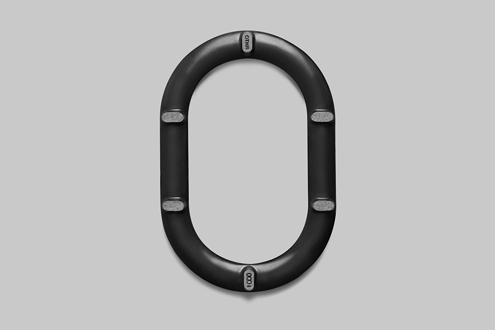
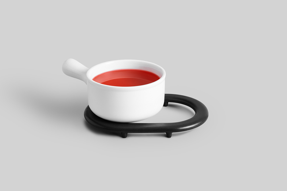
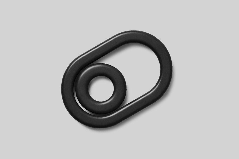
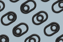
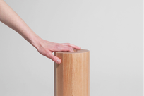
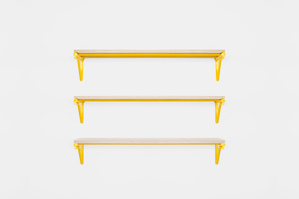
A set of sculptural nesting trivets, designed with efficiency in mind. Inspired by the looping shapes of freeway systems and the infrastructure of transportation, the VSBY Trivet is a take on the classic cast-iron model. Working within this language, we set out to create a visually compelling form that, while built for 3D printing, remains familiar.
The relationship between the feet and tracks of the trivet is inherently architectural; they act as piers supporting the deck of a bridge. The trivets can be used alone for small and medium items, or together for larger items.
-
Materials
3D Printed Porcelain


Catalina Chair & Table
-
Client
-
Development
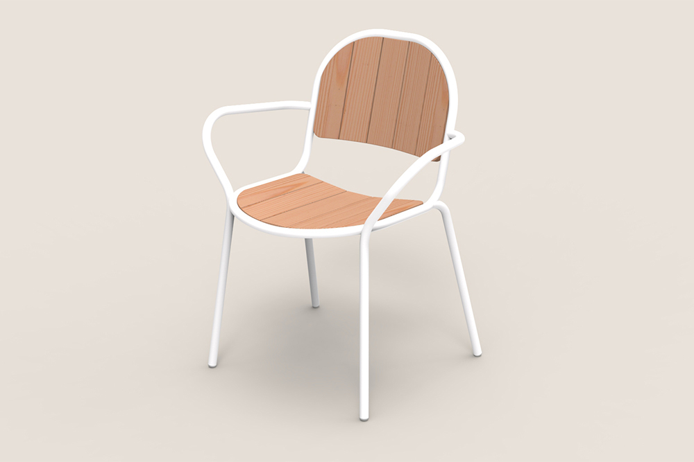
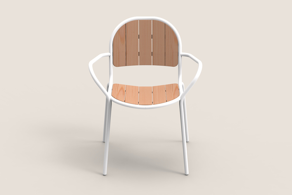
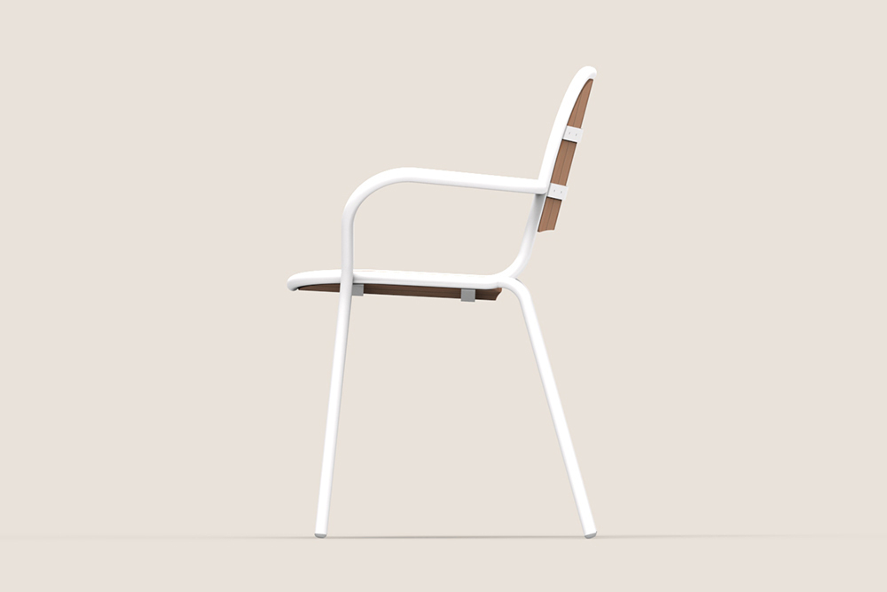
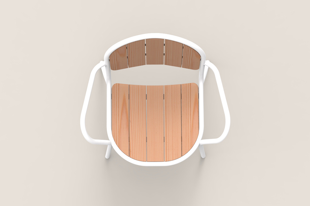
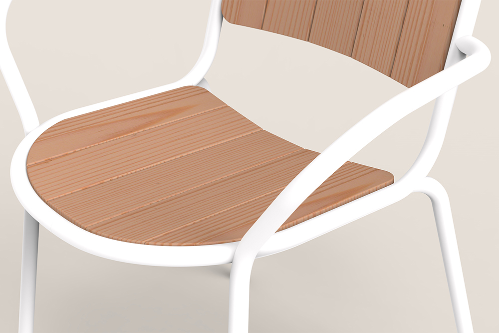
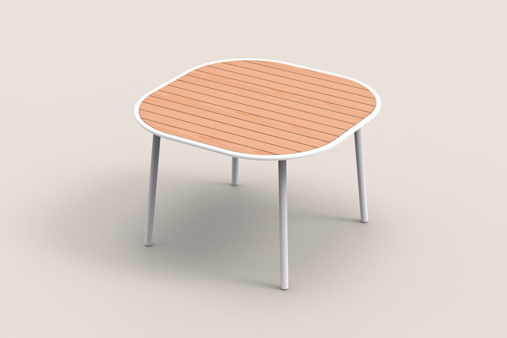
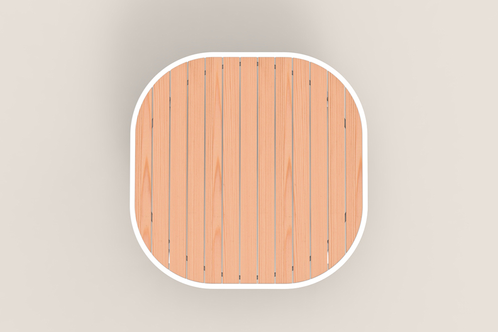
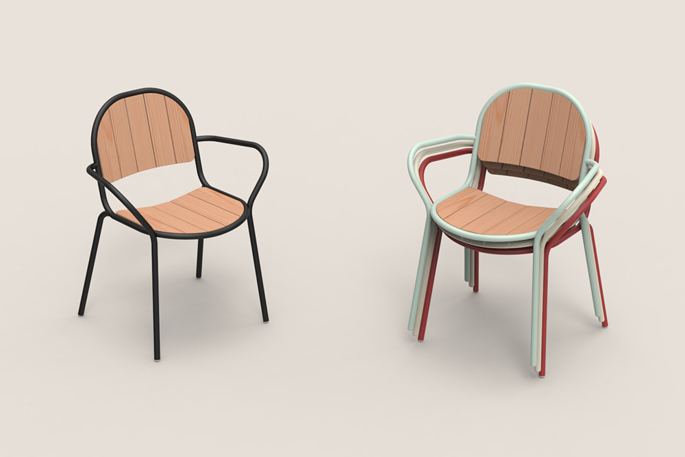
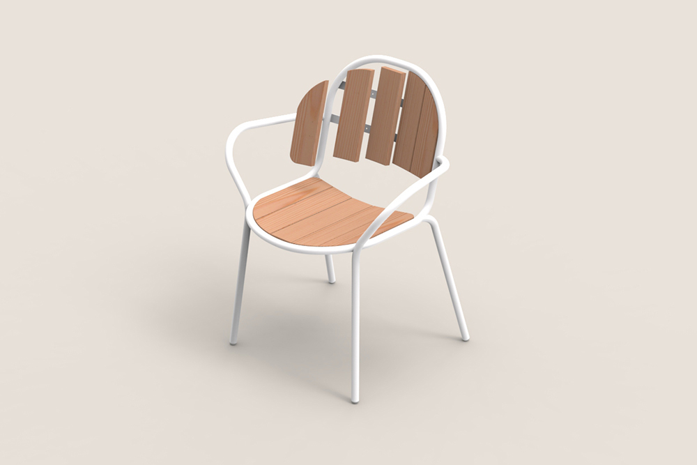
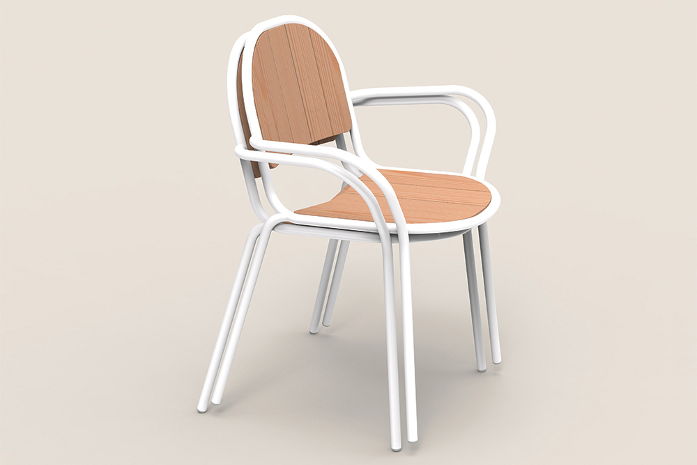
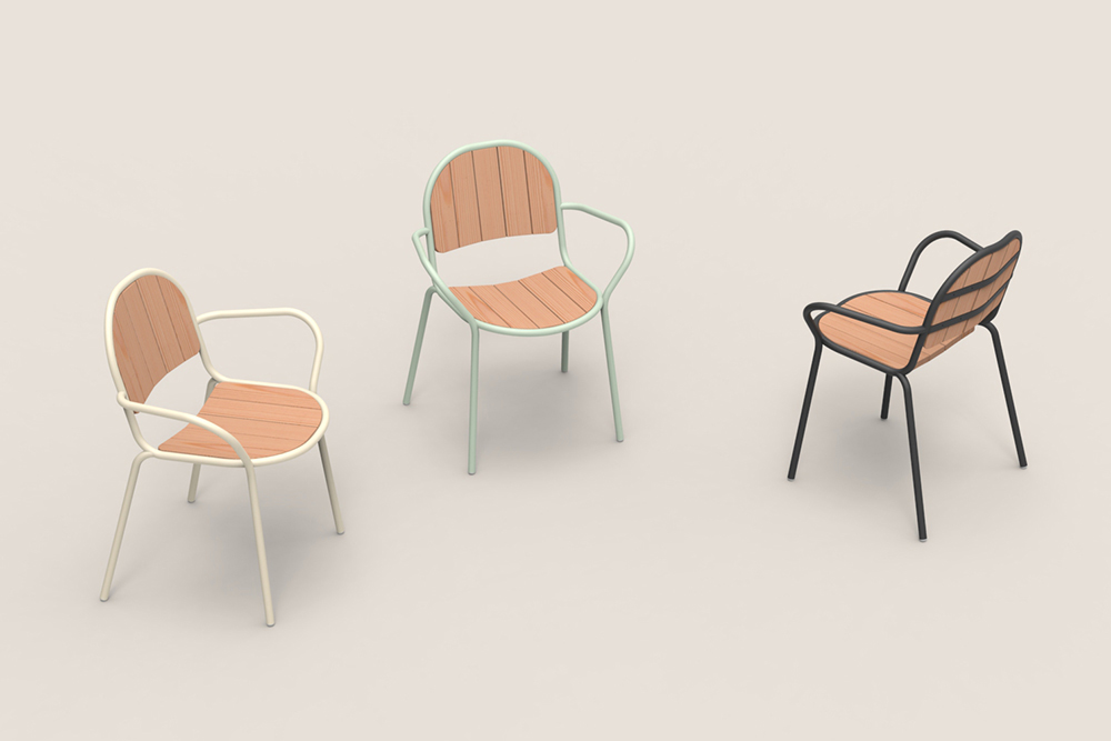
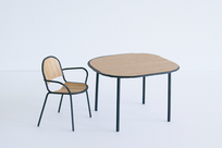
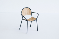
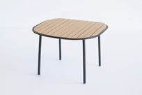
To celebrate Tectona's 40th anniversary, 11 designers from 11 countries were commissioned to develop a concept for a table and chair for outdoor use. We were honored to be included, and designed the Catalina Chair & Table for the competition.
There's a long history of slatted outdoor furniture. The focus was to use the familiarity of this language to inform a new perspective. The result, a chair and table that utilize Tectona's expertise and dedication to craft, to shape a union between aluminum tube and teak wood. The curvilinear tubular frame cradles wooden slats ideal for outdoor dining and entertaining. The slats placed side by side, similar to a barrel, conform to the body and allow water to pass through the gaps. The frame is formed to create the silhouette of a seating shell, the slats are added to complete the form. In the end, the dialogue between the rigid nature of the teak slats and the softness of the curving aluminum frame speaks of a sensitivity found in life outdoors
-
Materials
Teak Wood, Aluminum
Shapes Bundle Cork
-
Client
-
Development
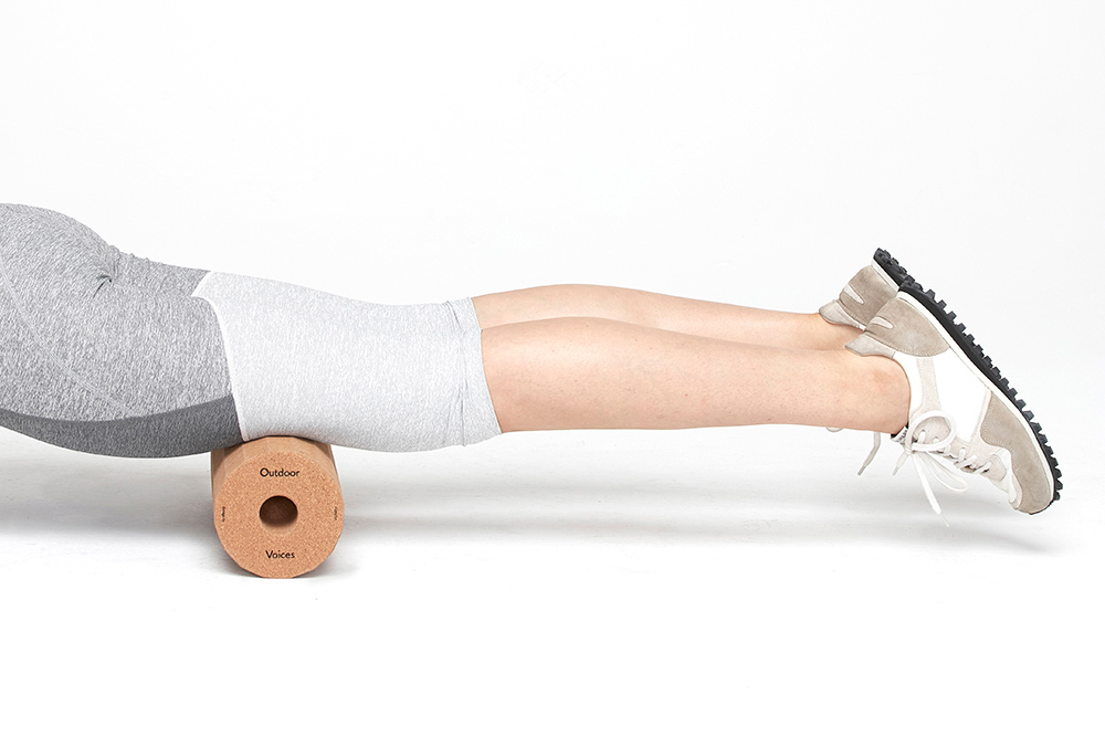
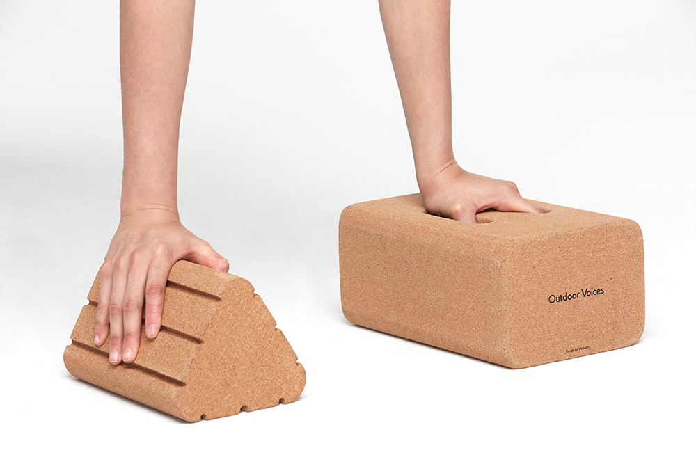
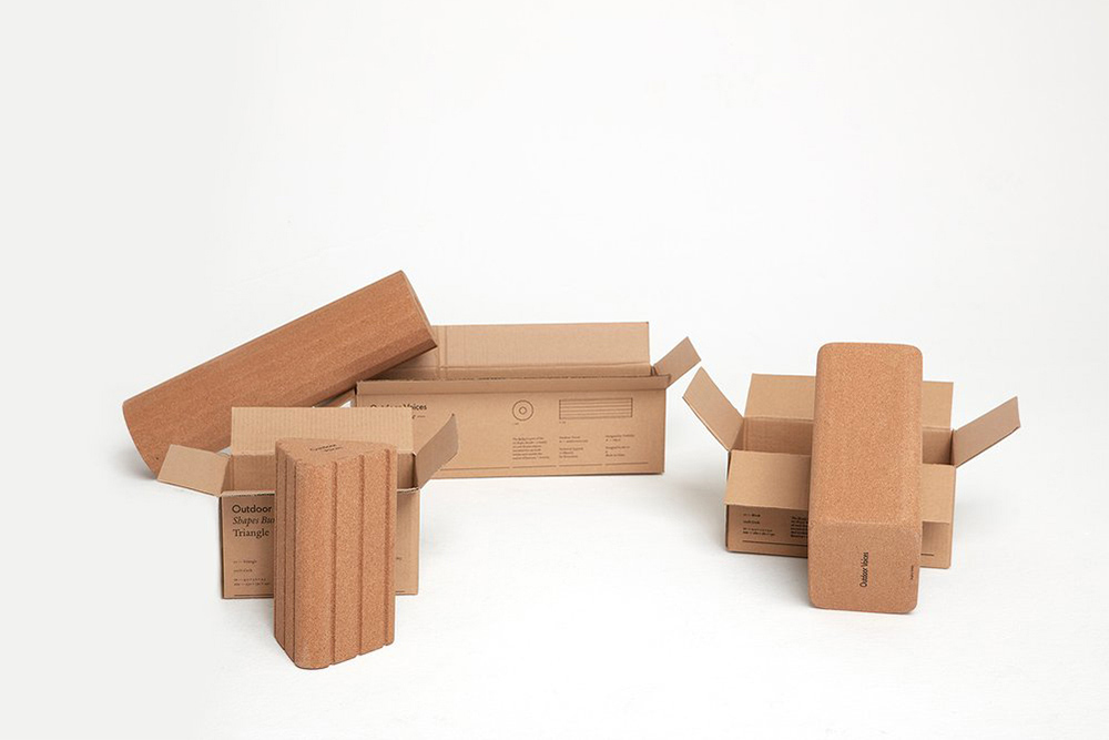
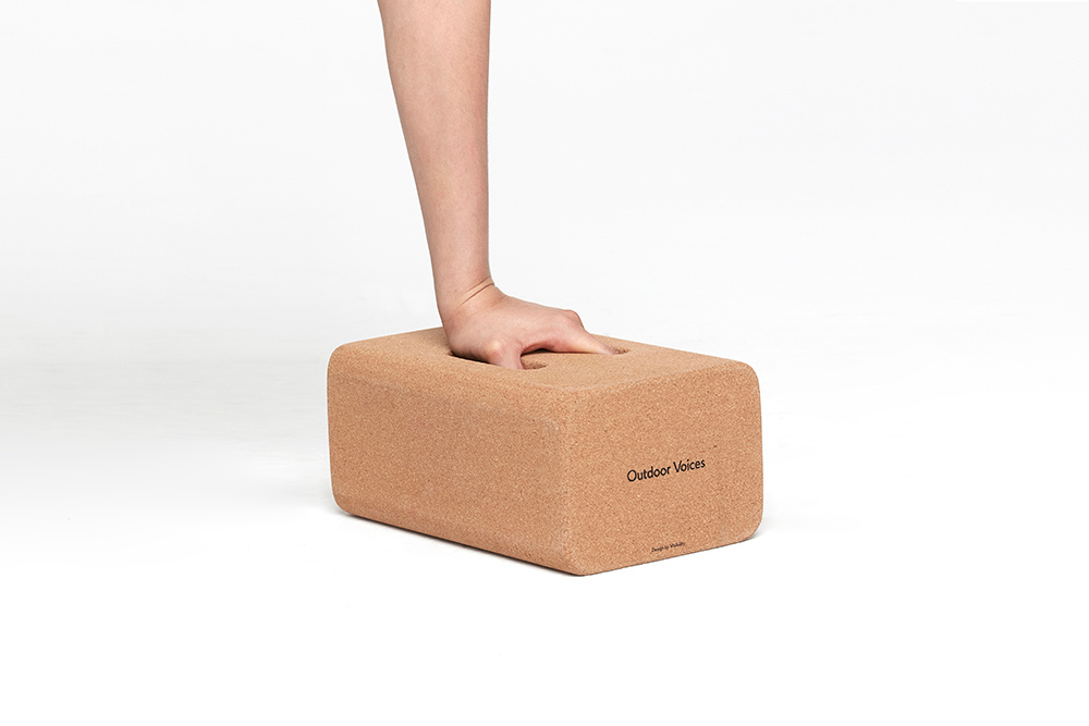
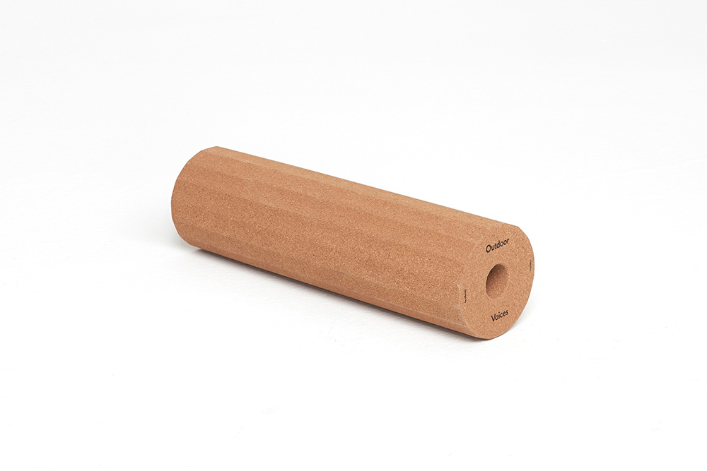
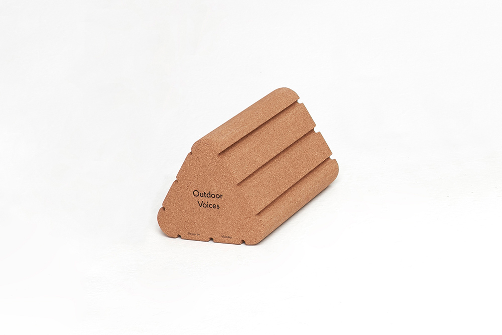
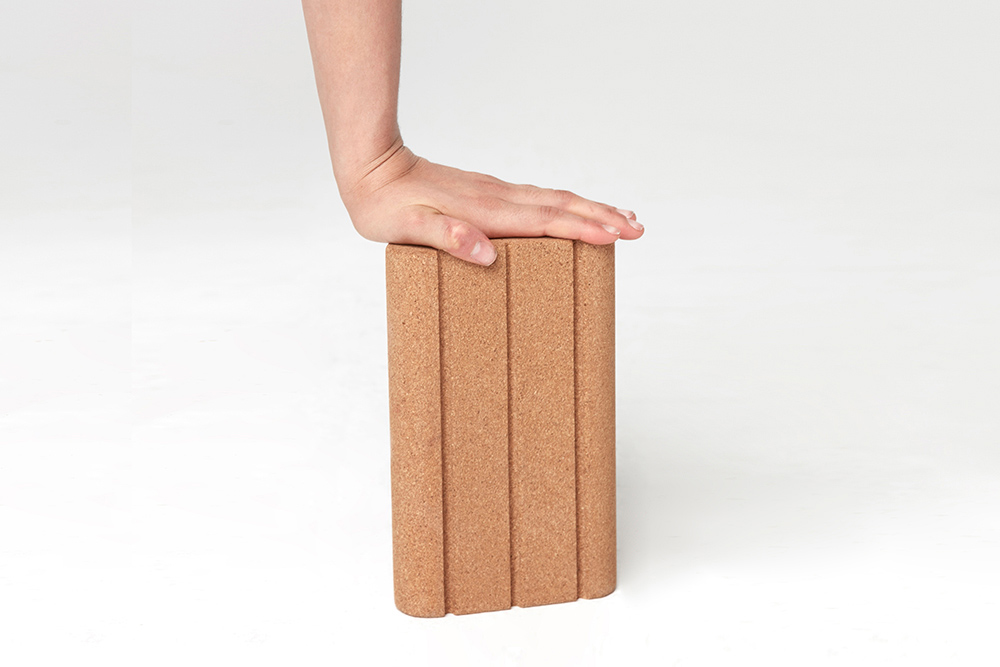
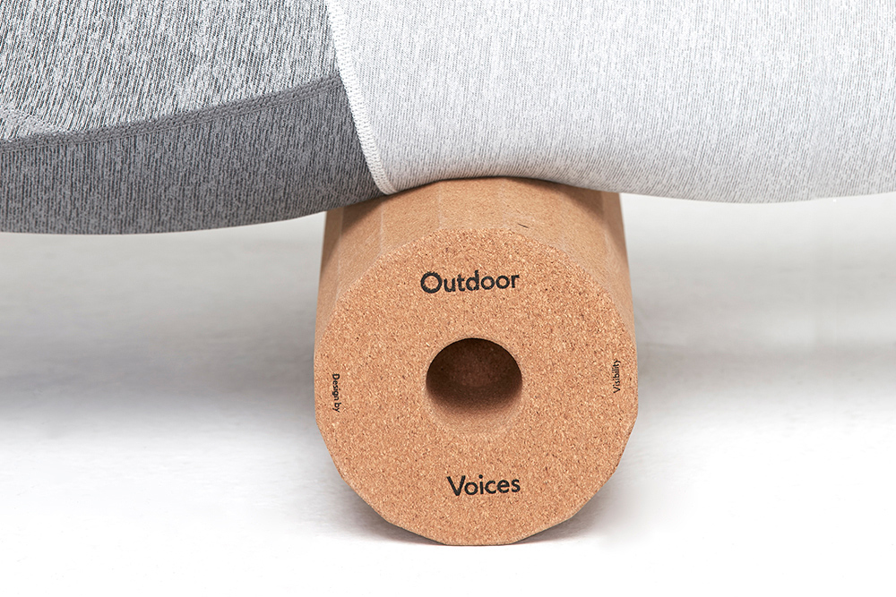
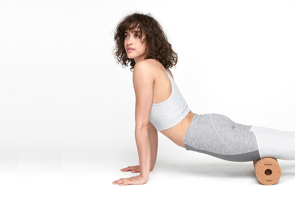
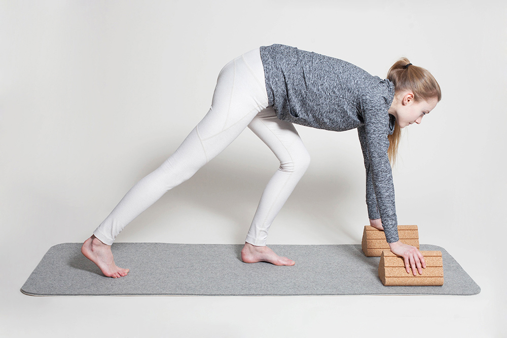
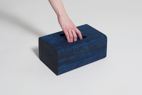
Shapes Bundle started as a collaboration with Outdoor Voices for Wallpaper* Handmade in 2015. Initially shown in Milan, the project received positive interest and we began working with Outdoor Voices to bring the blocks into production. The results of this year long effort are the three central forms from the original Shapes Bundle, adapted to cork and refined for everyday use.
We align ourselves with companies that share our interest in good, enduring design. With Outdoor Voices, there was an exciting opportunity to collaborate on a common goal: elevating the fitness space. The challenge was to create something that was functional, but also considered in design and something people wanted to display rather than hide.
The blocks; a Roller, Block, and Triangle, can be used together or individually across different fields of exercise. With a playful nod to tactility and material interaction, they elevate the traditional fitness kit and encourage users to find new ways to stretch, bend, and play. The cork is lightweight and easy to maneuver, impervious to sweat, anti-microbial, and slip resistant.
-
Materials
Cork


Champ Stool
-
Client
-
Development
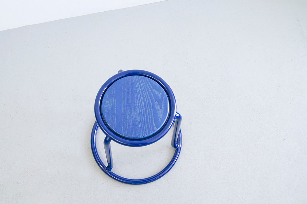
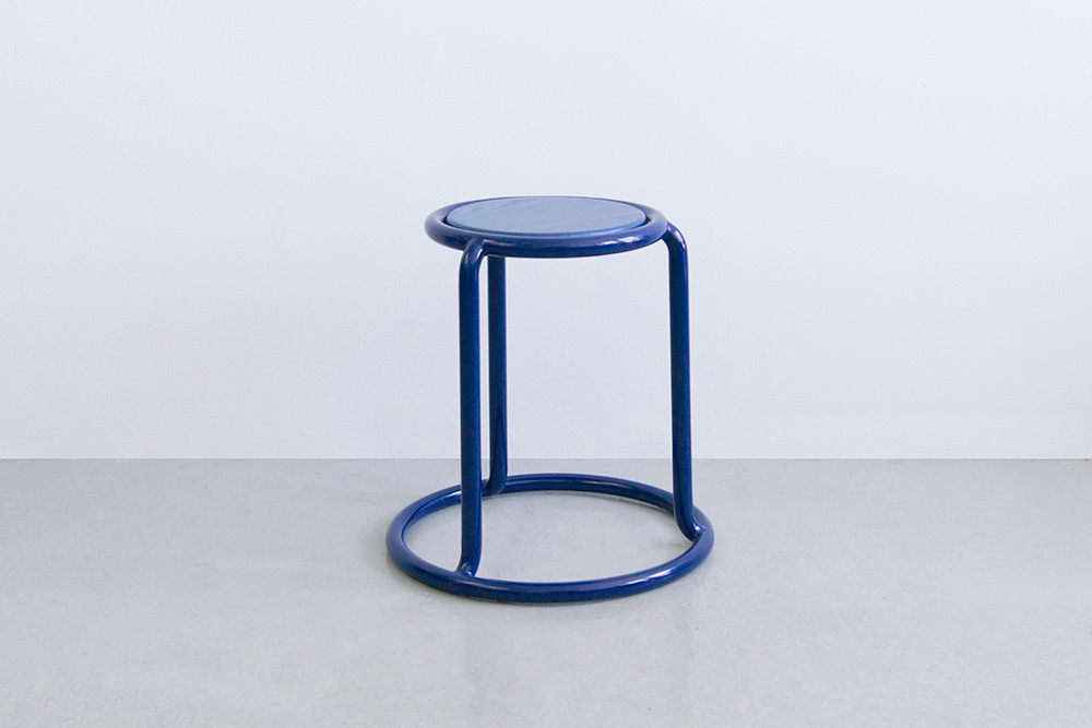
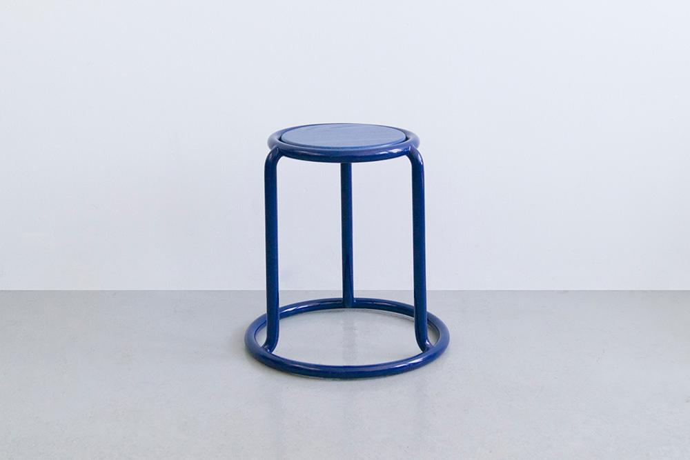
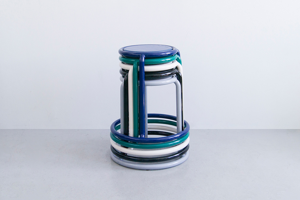
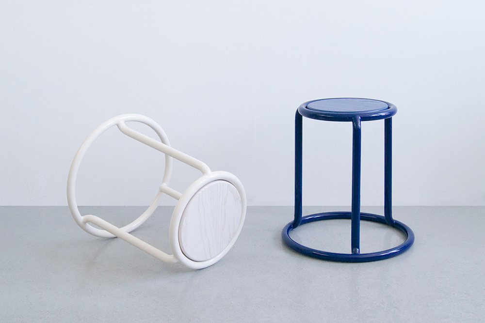
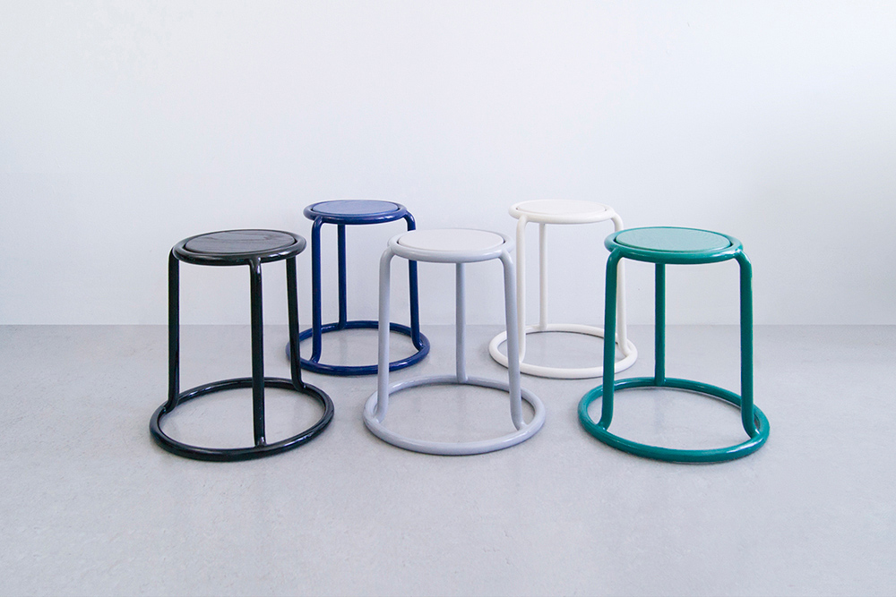
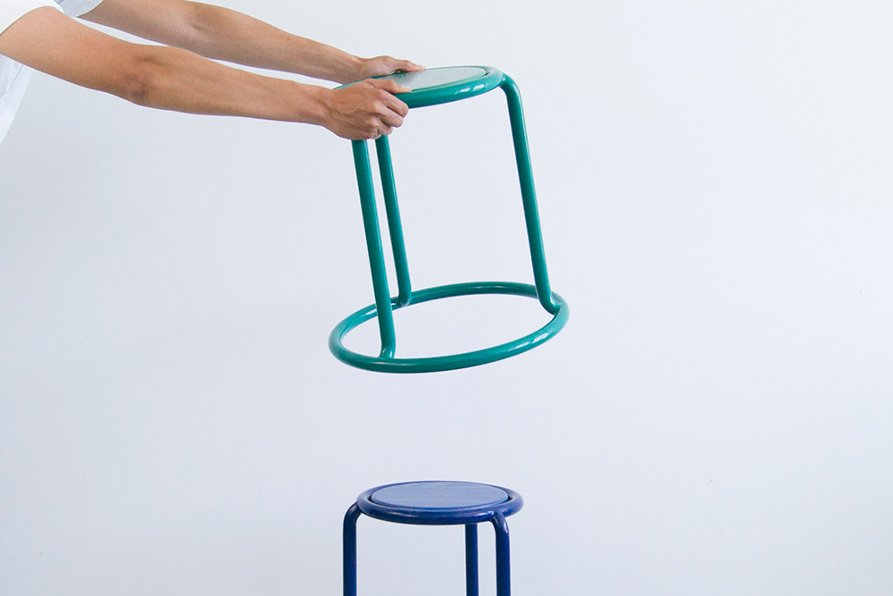
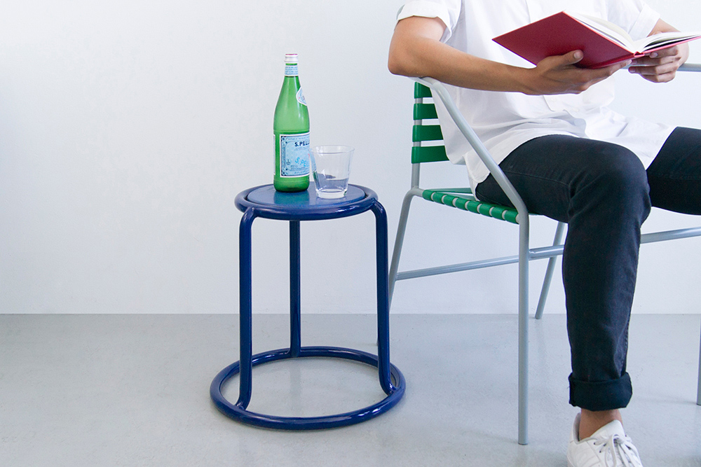
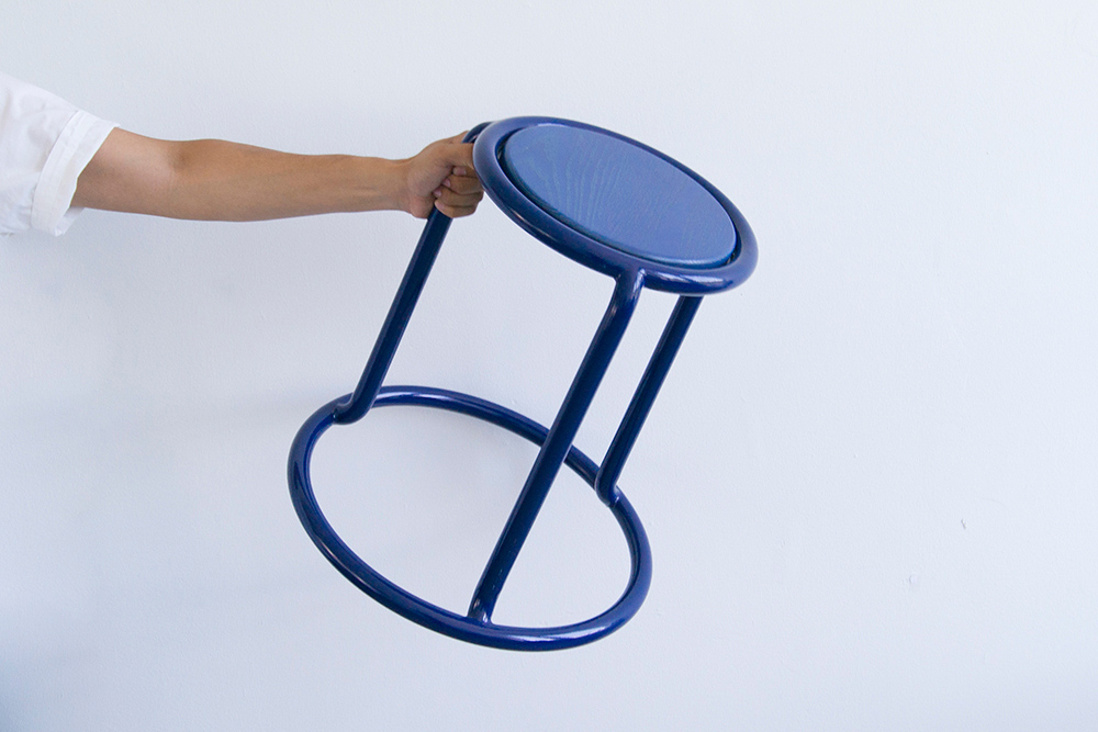
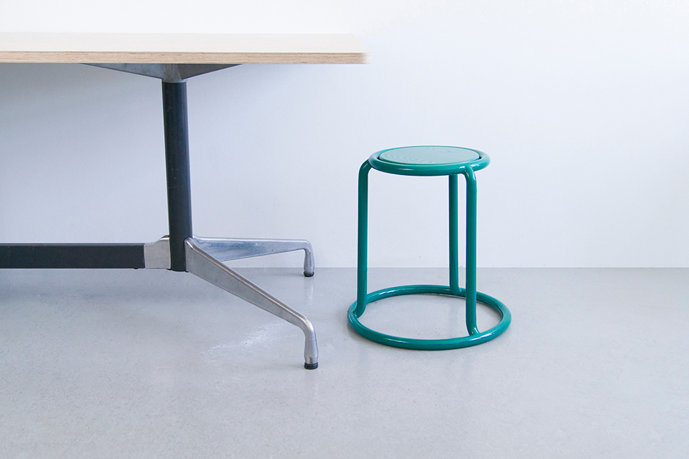
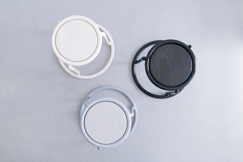
Champ is a bent tubular steel stacking stool. Intended to slip effortlessly into a home, café, or office, the large diameter tubular steel gives the stool a pleasant familiarity. Named with a nod to it's similarity to a champagne cage, Champ is a stool that finds function in it's casual and practical nature.
One of few circular tubular stacking stools, its simple form is made possible by expert tube bending, allowing for infinite stacking without exaggerated proportions. The tube also makes for easy grabbing, and allows one to stack it without difficulty. The stool is built on two concentric circles that are linked to three legs by a seamless joint, the result of a deep exploration into connections and metalworking techniques.
Winner of the 2016 ICFF Editors Award for Best Portable Design.
-
Materials
Tubular Steel, Dyed Wood Seat
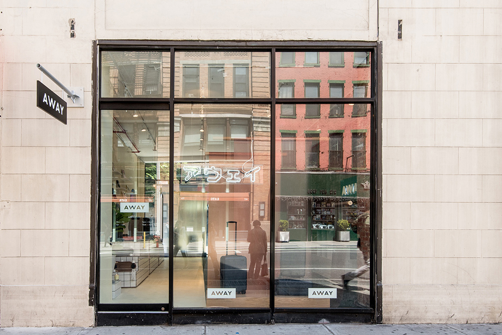
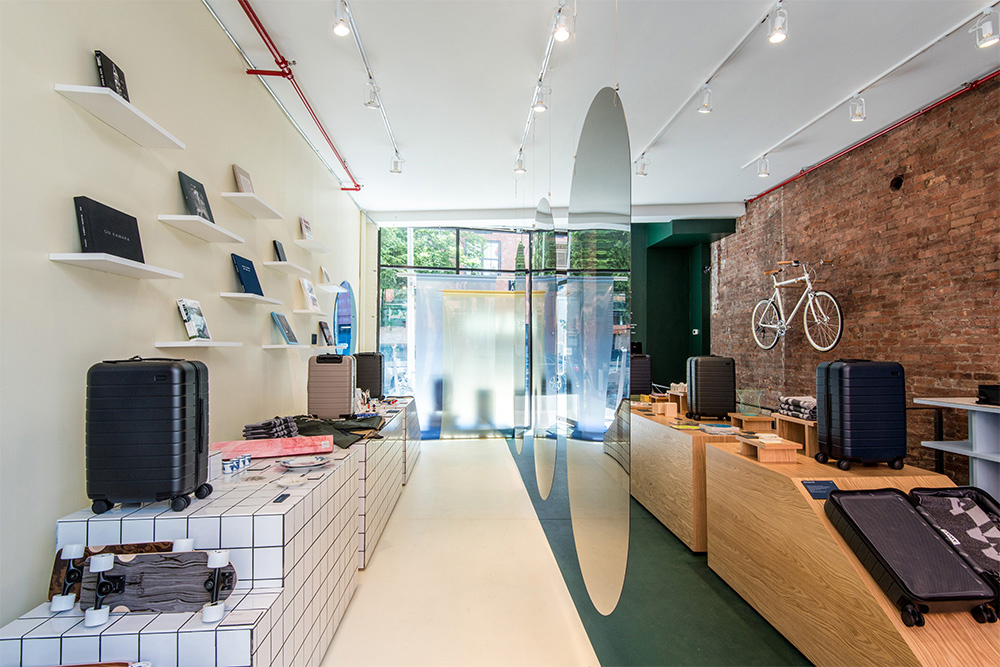
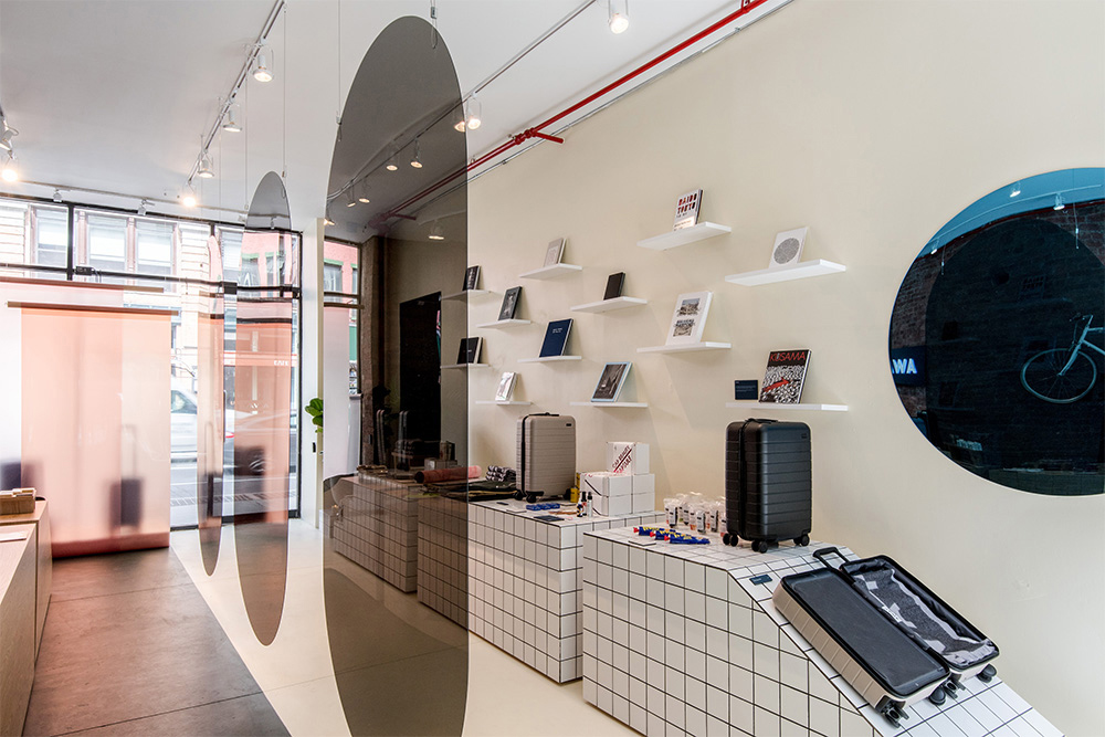
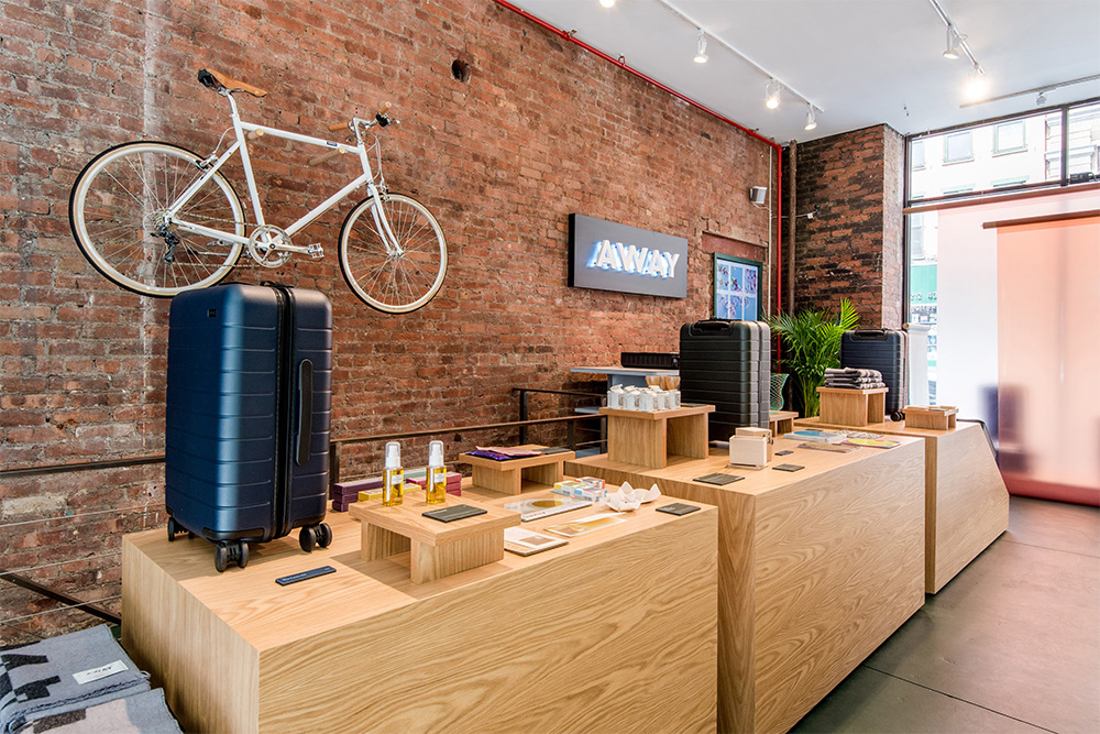
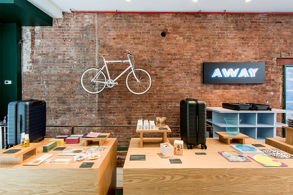
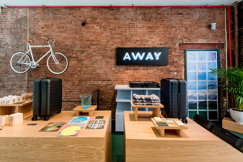
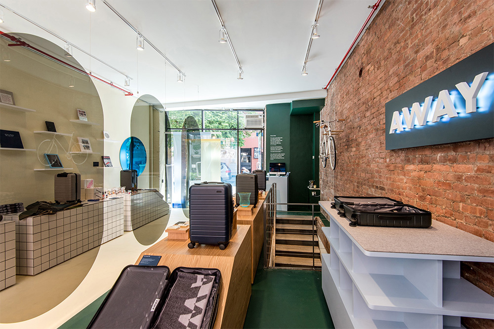

Away Concept Store
-
Client
-
Development
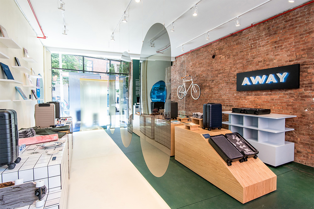
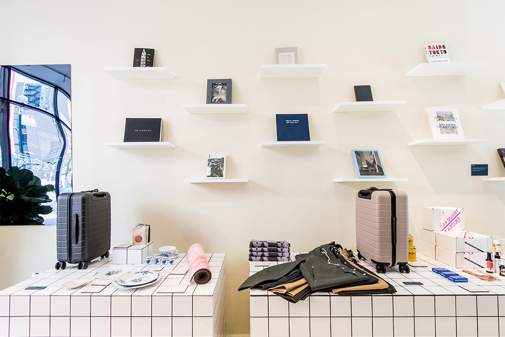
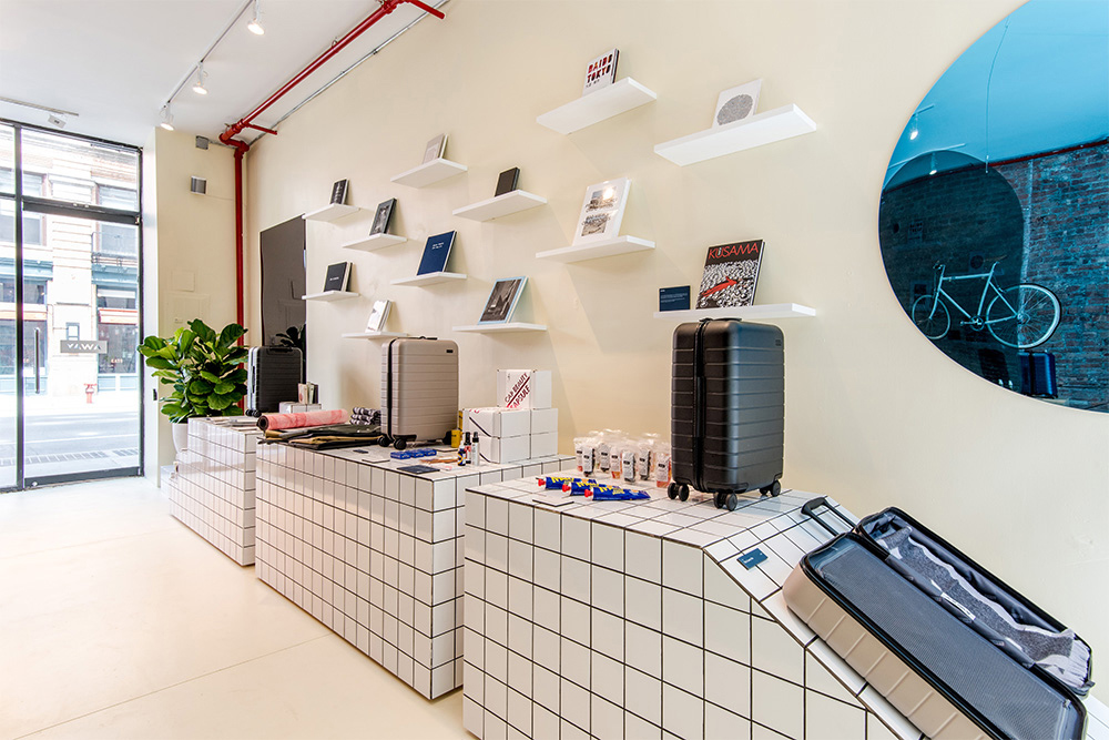
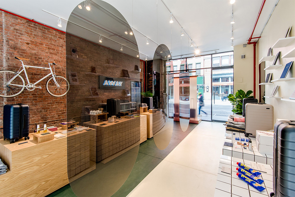
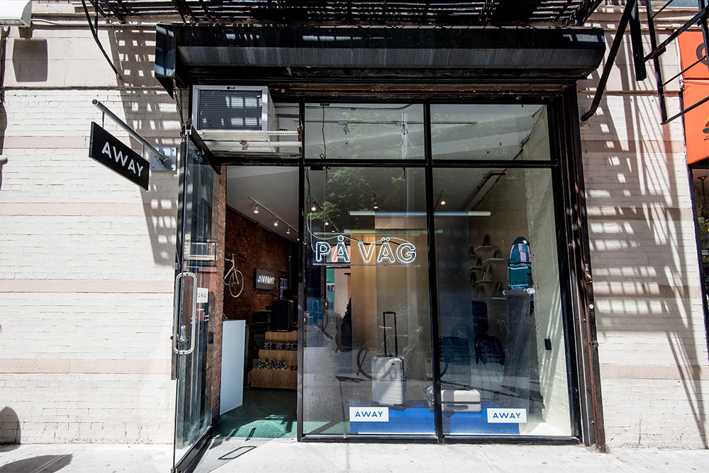
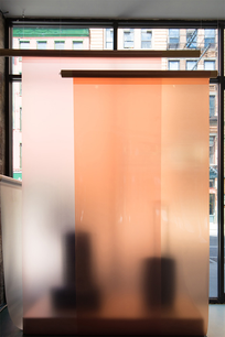
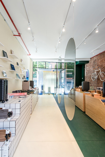
When approached by Away to design their first concept store, the idea of traveling from city to city came up in our early discussions. By designing a store that contrasted two destinations, we could highlight Away’s suitcase as a vehicle for travel rather than an accessory to it.
The pop-up style approach to this project gave us the opportunity to think about bolder, broader strokes that we could make in the very beginning. It became about what simple but impactful decisions we could make to ensure that the store provides a meaningful experience that elevates the suitcases. The site has two entrances, driving our design to incorporate two unique storefronts and two unique sides to the store while implementing an easy flow for visitors. The two cities chosen for the store are Stockholm and Tokyo, each with a distinct storefront.
White oak and richer colors are used on the Tokyo side, while white tile and lighter colors are used on the Stockholm side. With the hanging dividers that reference aviation forms in the center of the space, we were able to create a division in a way that allows one to move through the curated displays on each side uninterrupted. The fixtures in the space take reference from architectural forms, a further nod to the destinations. They are also removable, and can be used for future installations; they are designed to contrast in their materiality and can therefore be used for future dual-city concept stores. The window displays also allow for backdrops that can be changed as needed, allowing for flexibility in their use.
Images courtesy of Albert Cheung.
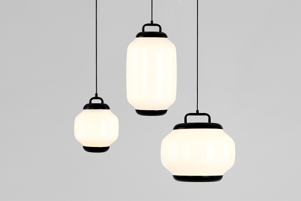

Esper
-
Client
-
Development
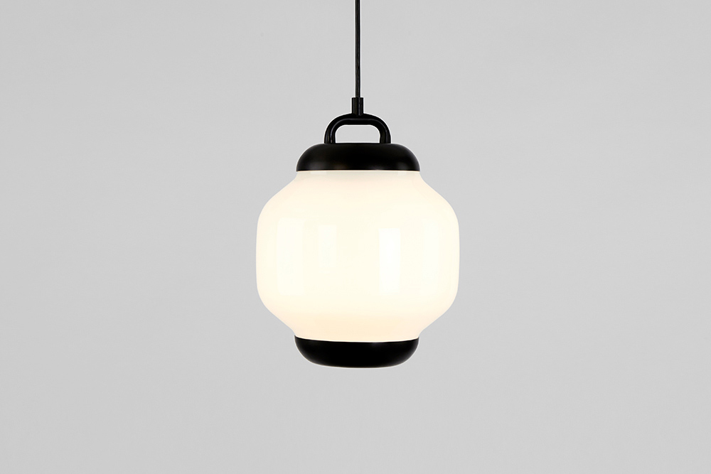
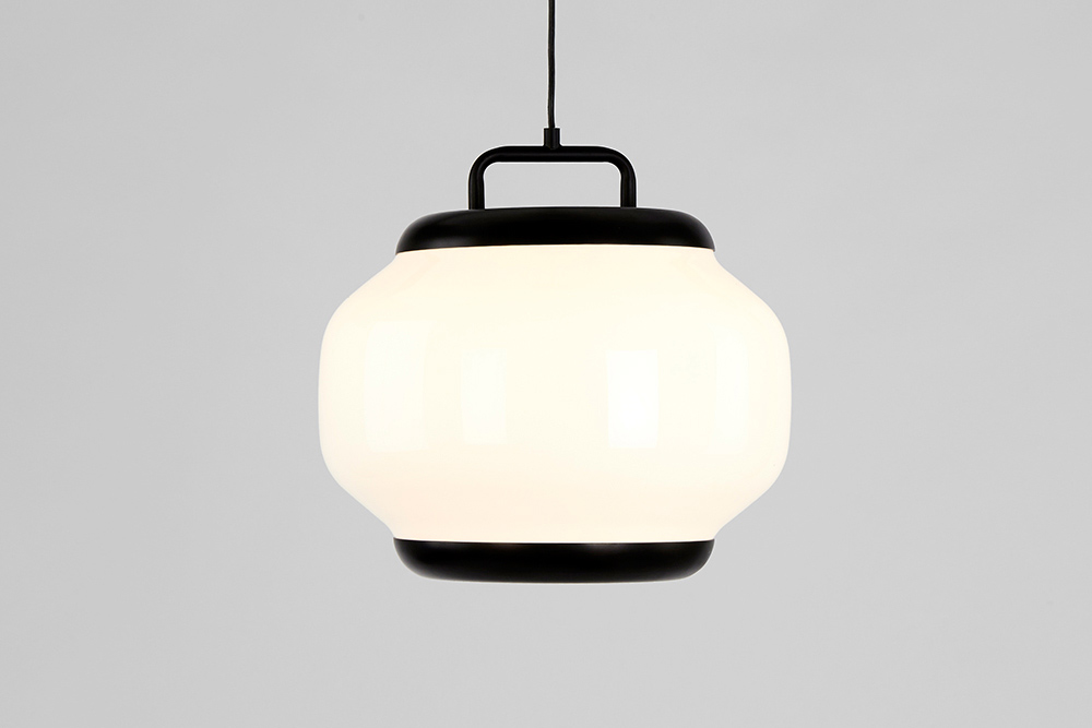
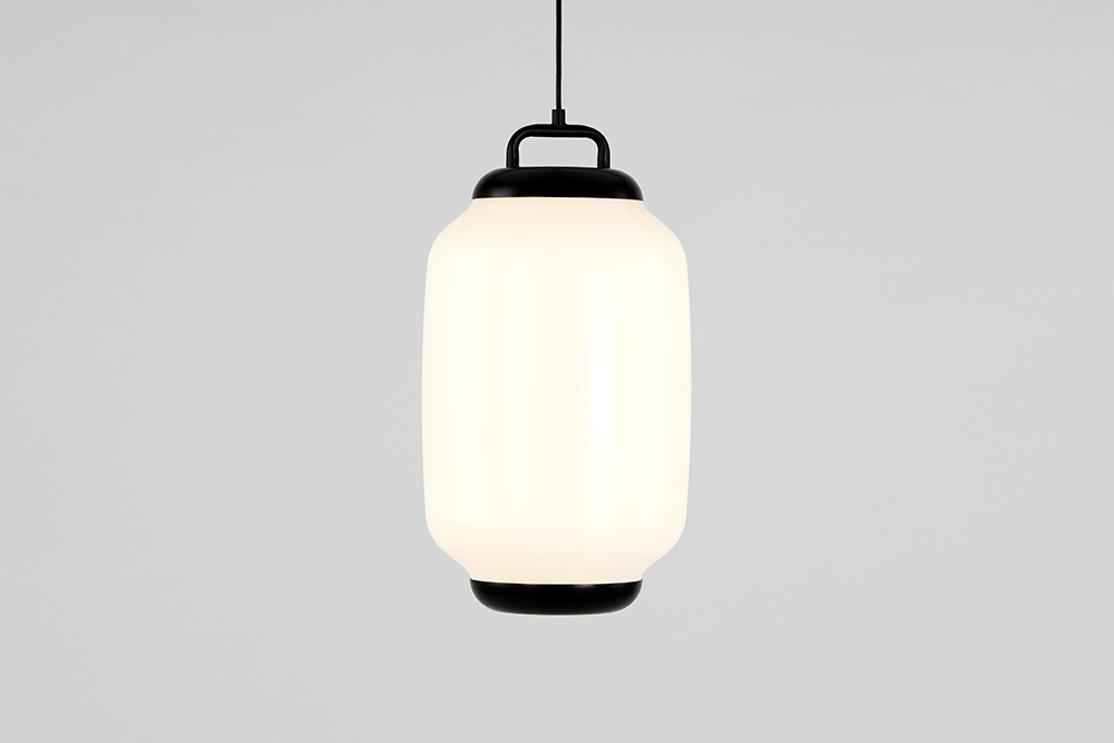
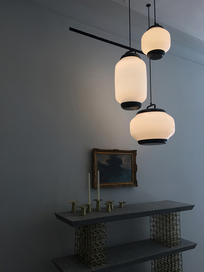
The Esper lamps take inspiration from chochins, the archetypal lanterns typically found outside sushi restaurants and late night hangs-outs in Japan. The three different forms are distortions of the iconic lanterns, with smooth and spartan shapes that look to the future while retaining the humility of centuries past.
The top and bottom caps maintain the lantern iconography and have functional purpose, emitting light and distributing it evenly through the globe. The yoke on the top looks and acts as a handle, but more importantly it's the connection to the cord which hangs it from the ceiling. By marrying the warmth and simplicity of traditional chochins with the thoughtfulness and quality that Roll & Hill is known for, Esper looks to become a future classic.
-
Materials
Blown Glass, Steel


Polarity Collection
-
Client
-
Development
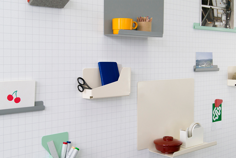
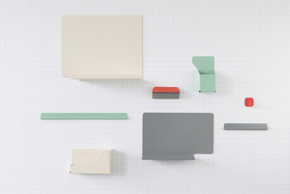
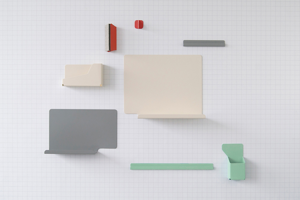
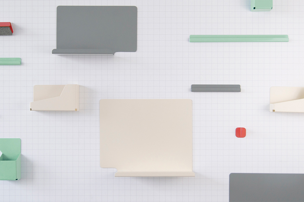
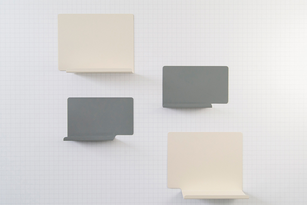
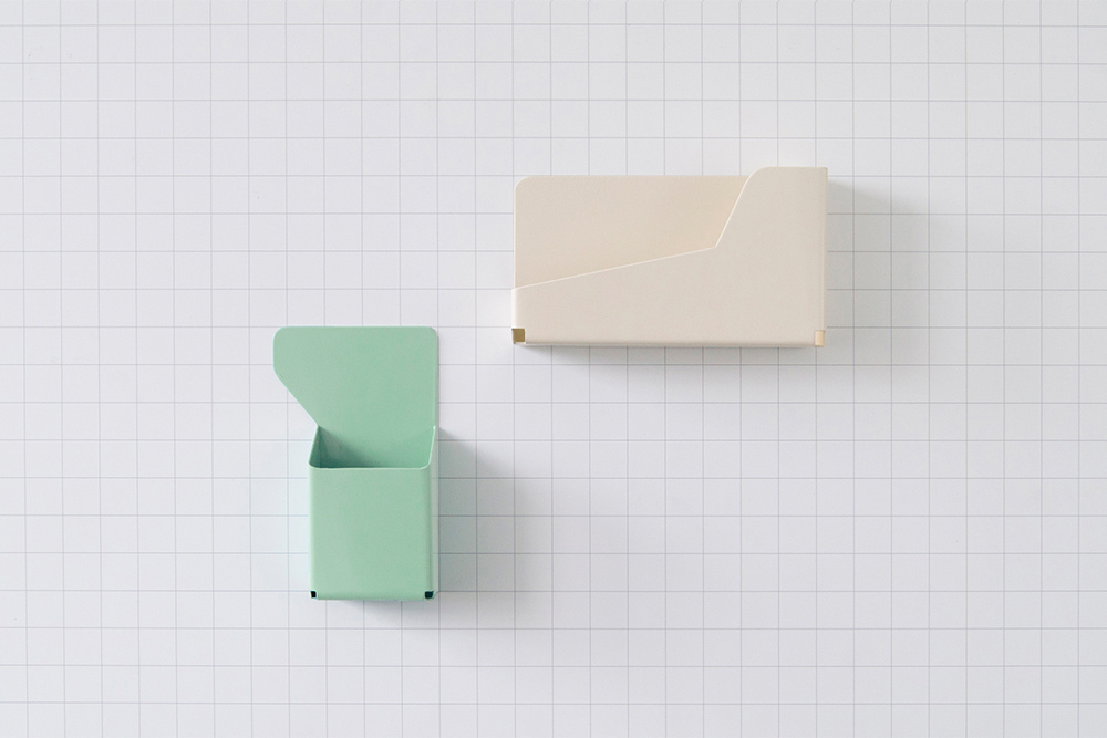
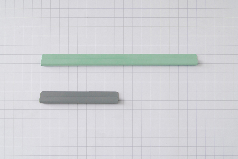
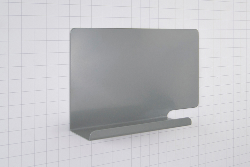
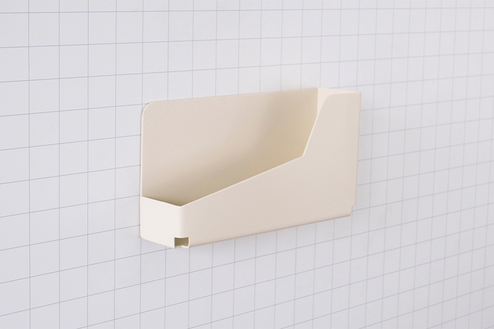
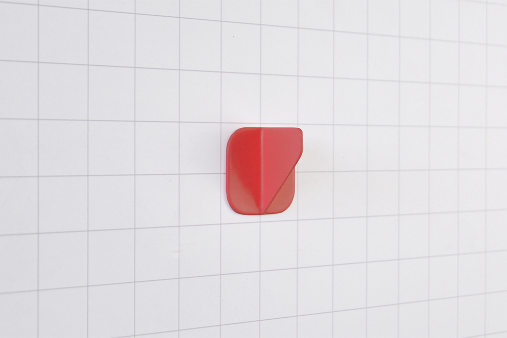
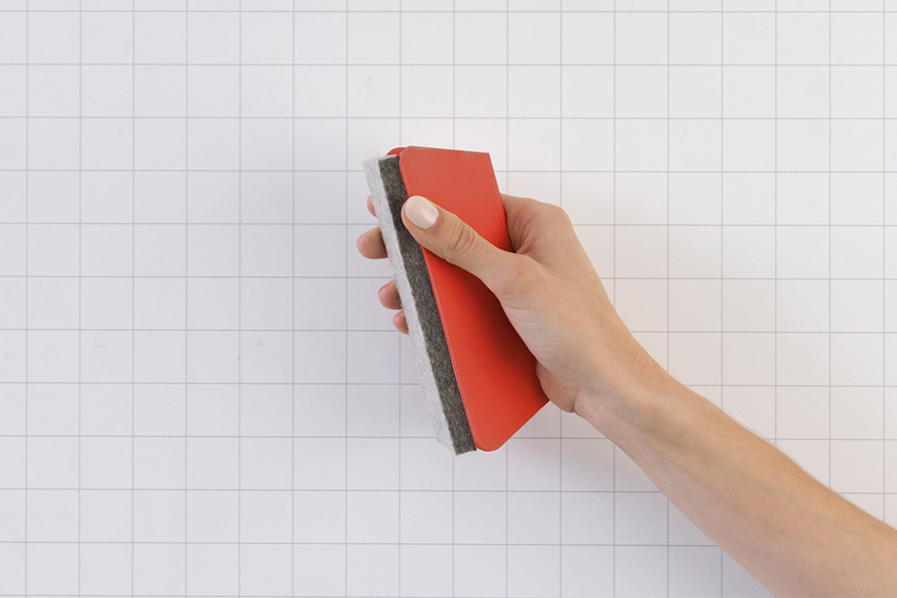
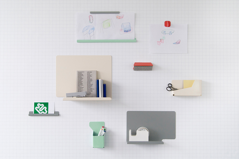
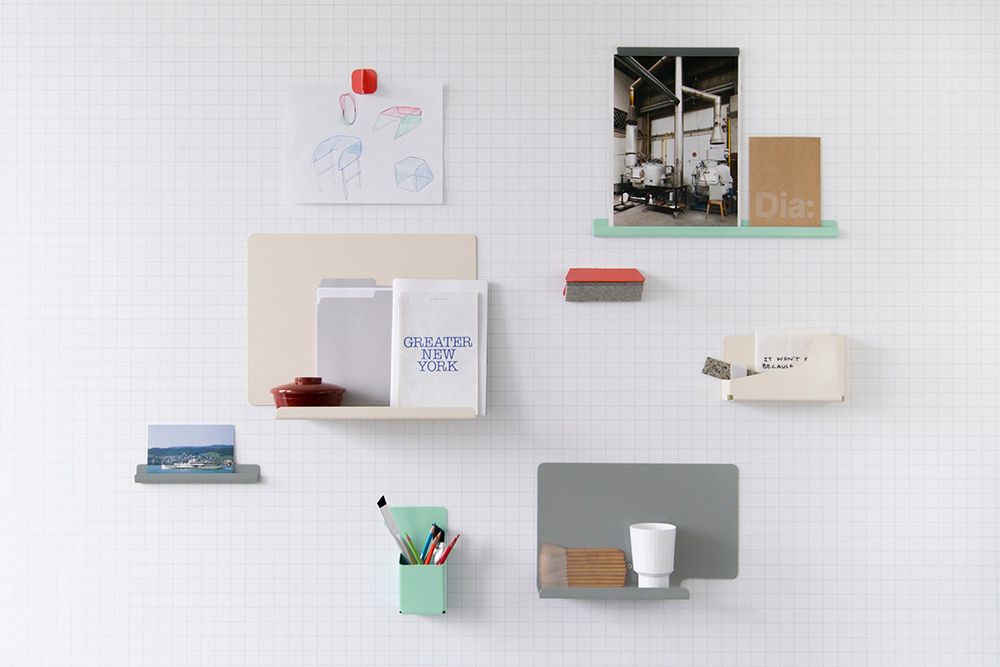
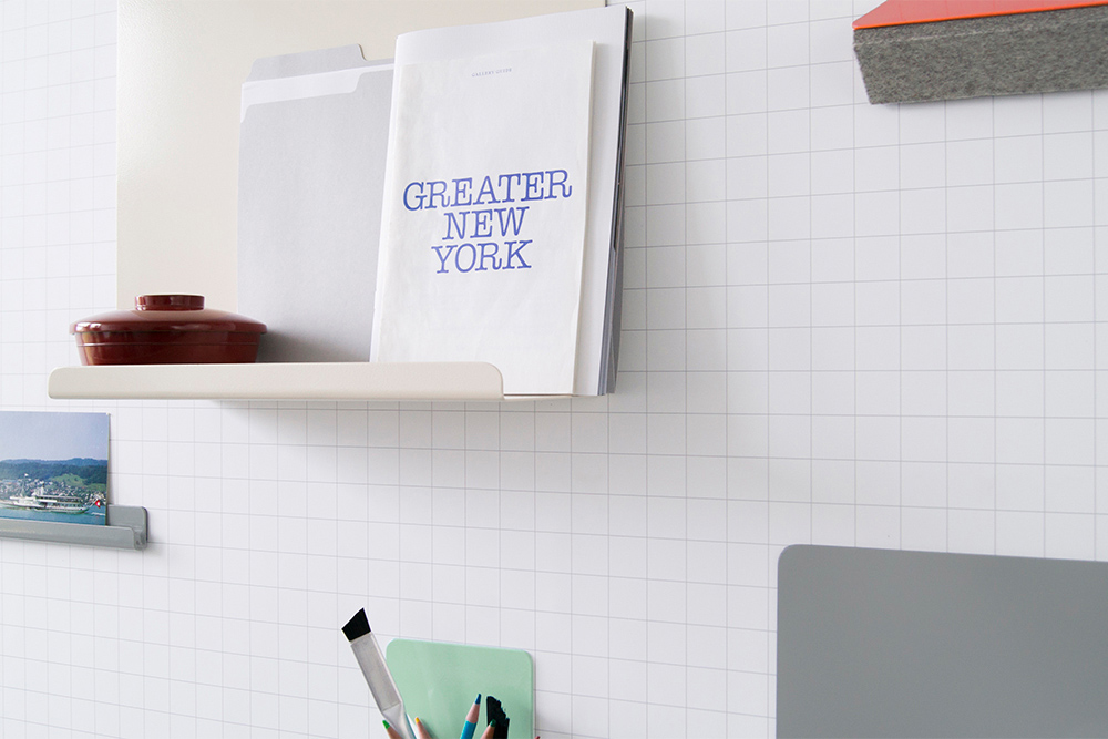
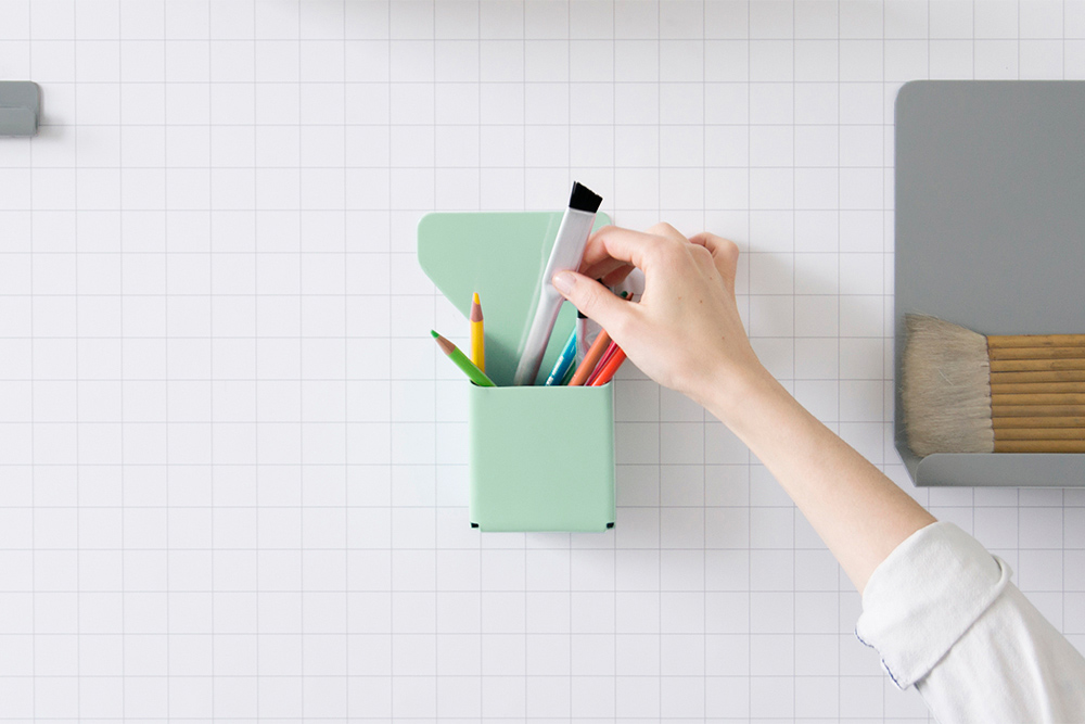
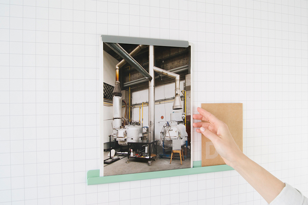
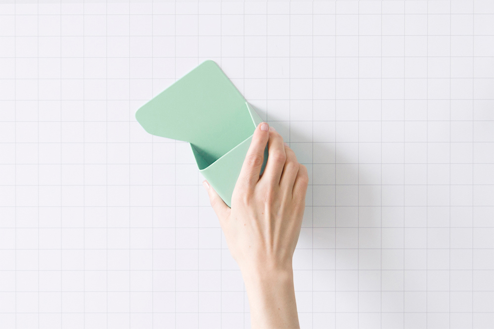
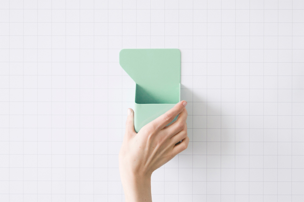
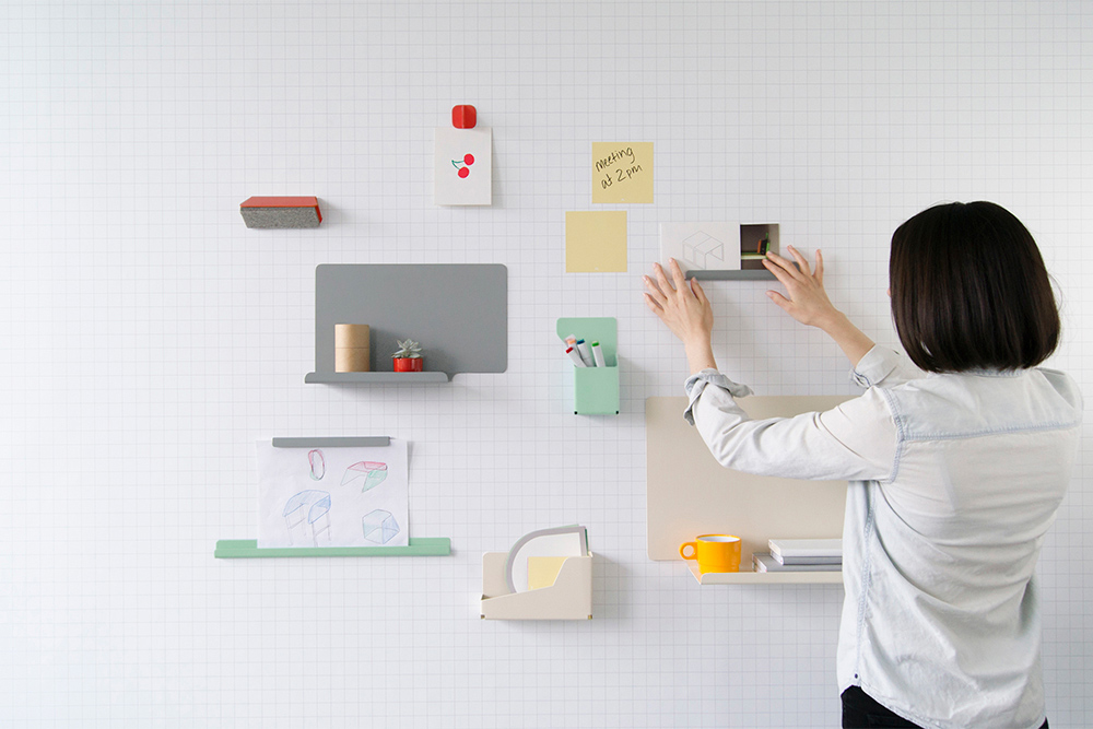
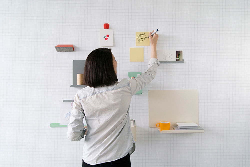
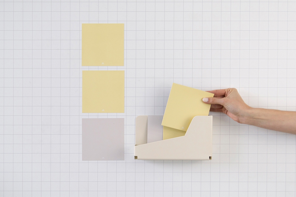
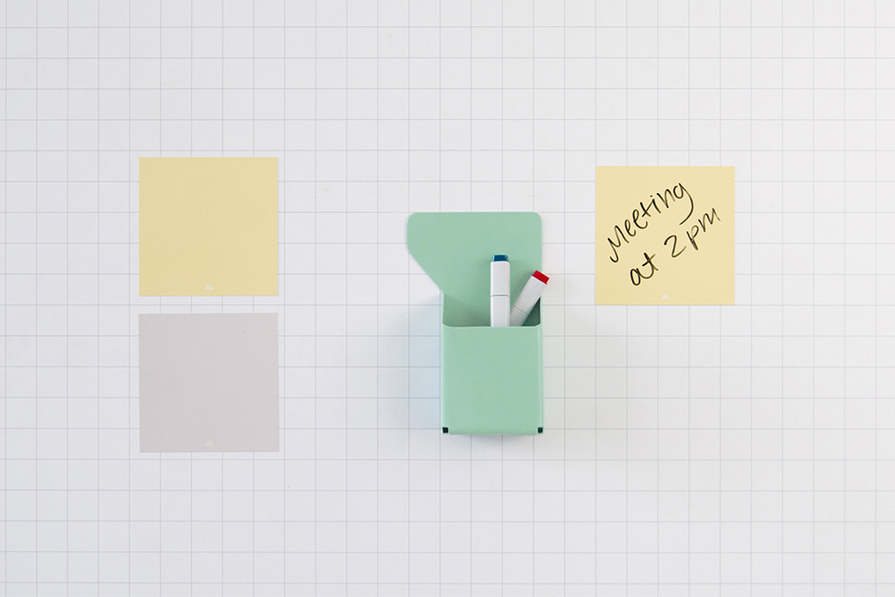
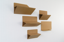
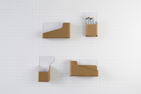
The Polarity Collection is designed to highlight Visual Magnetics' InvisiLock technology, a powerful feature allowing 3D objects to be mounted to the wall surface using interlocking magnetic polarities.
The collection takes reference from shapes of files and folders, borrowing from their iconic and functional forms. The user-friendly system ensures a perfectly straight application and allows for endless reconfigurations. The design uses sheet metal like paper, folding up to make three dimensional forms that are dynamic and useful. The Polarity Collection is made up of two shelves, paper displays, marker holders, solo magnet, catch box, and dry eraser.
The collection is intended to work in tandem with Visual Magnetics' new Workspace Collection, a full line of writable wall coverings integrating the brand’s signature magnetic materials with multi-layer dry erase capabilities.
See a video about the Polarity Collection here.
-
Materials
Sheet Steel


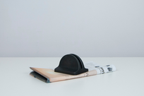
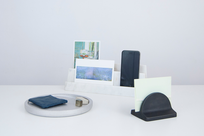
Kyuzo Collection
-
Client
-
Development
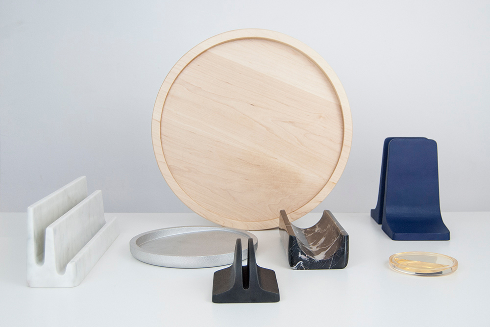
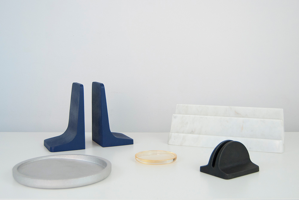
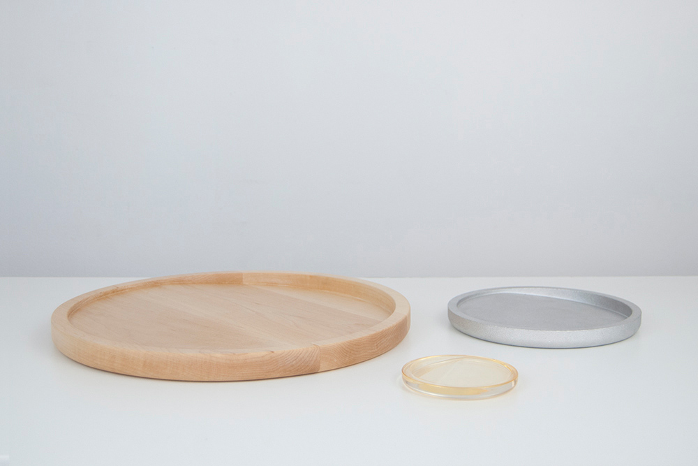
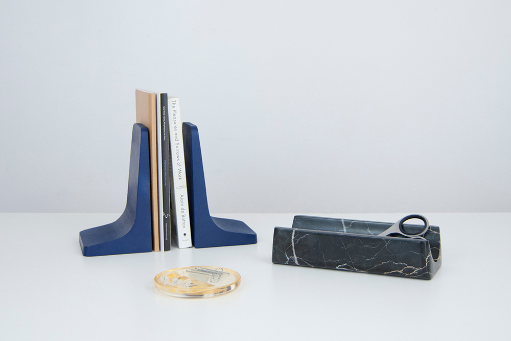
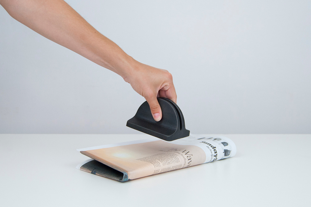
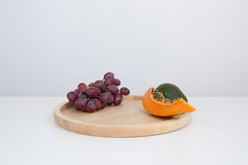
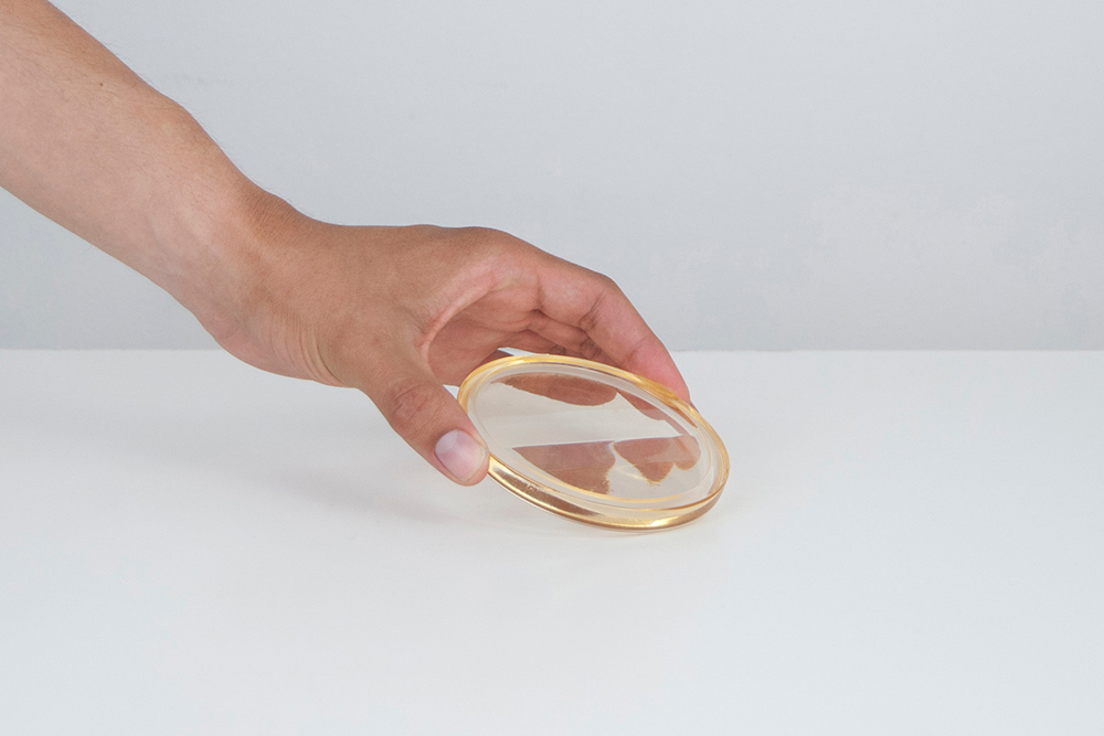
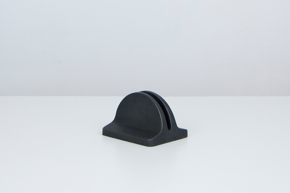
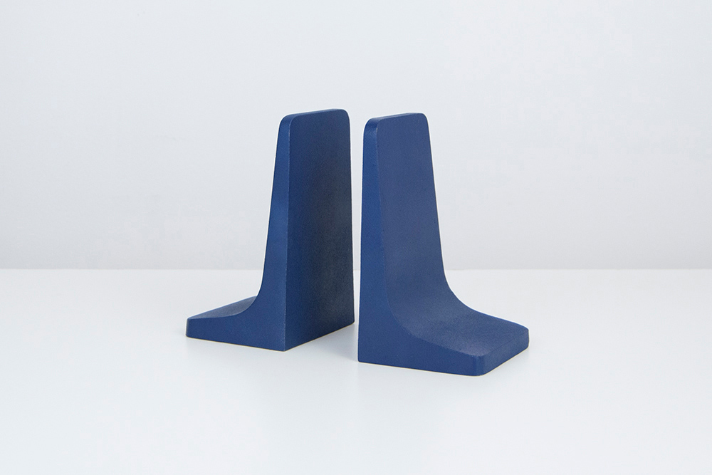
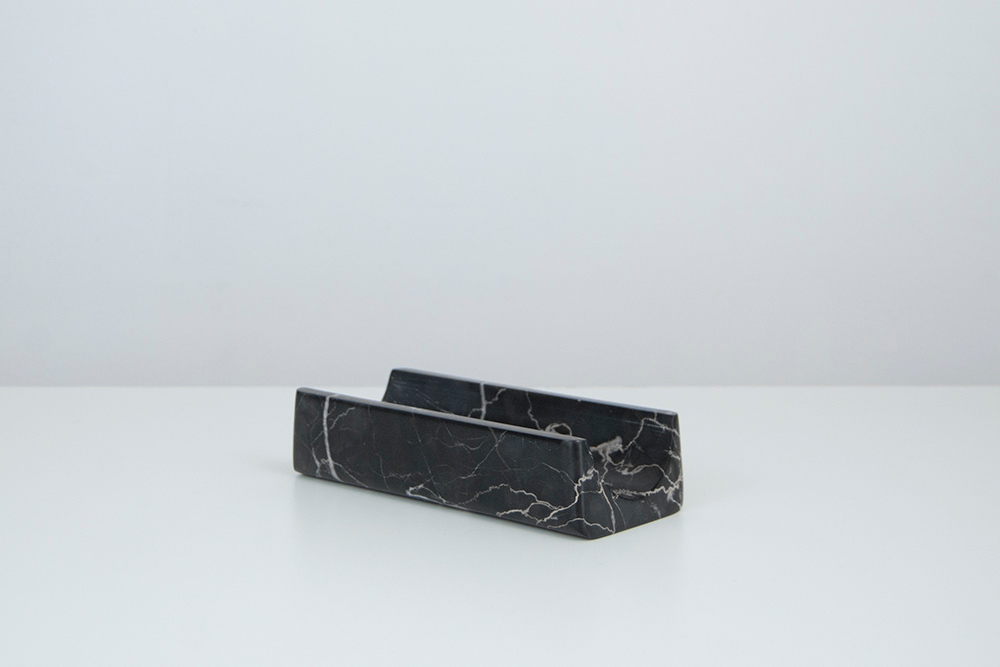
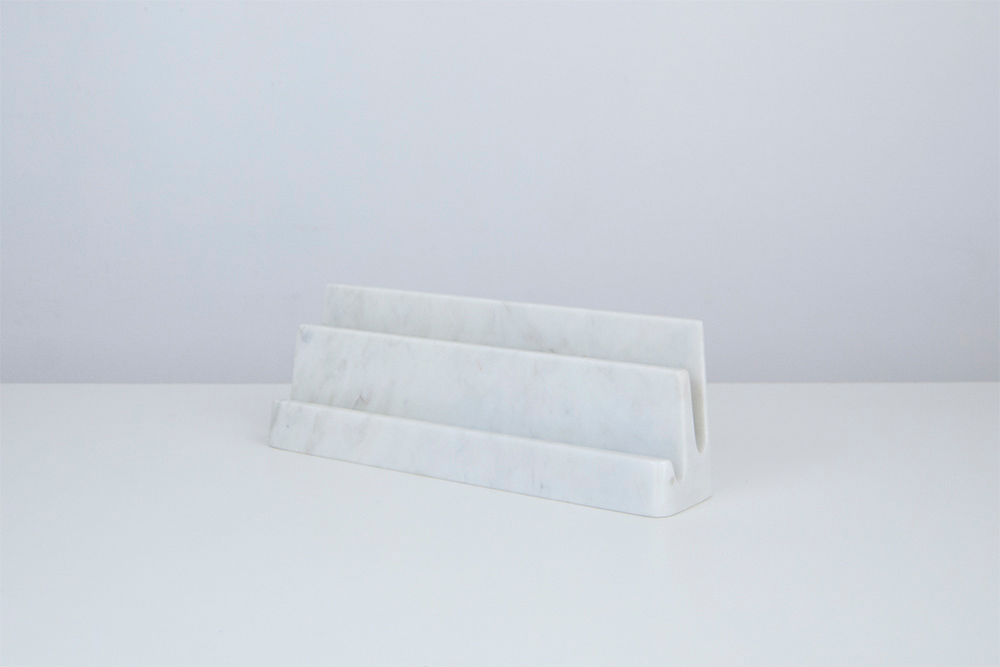
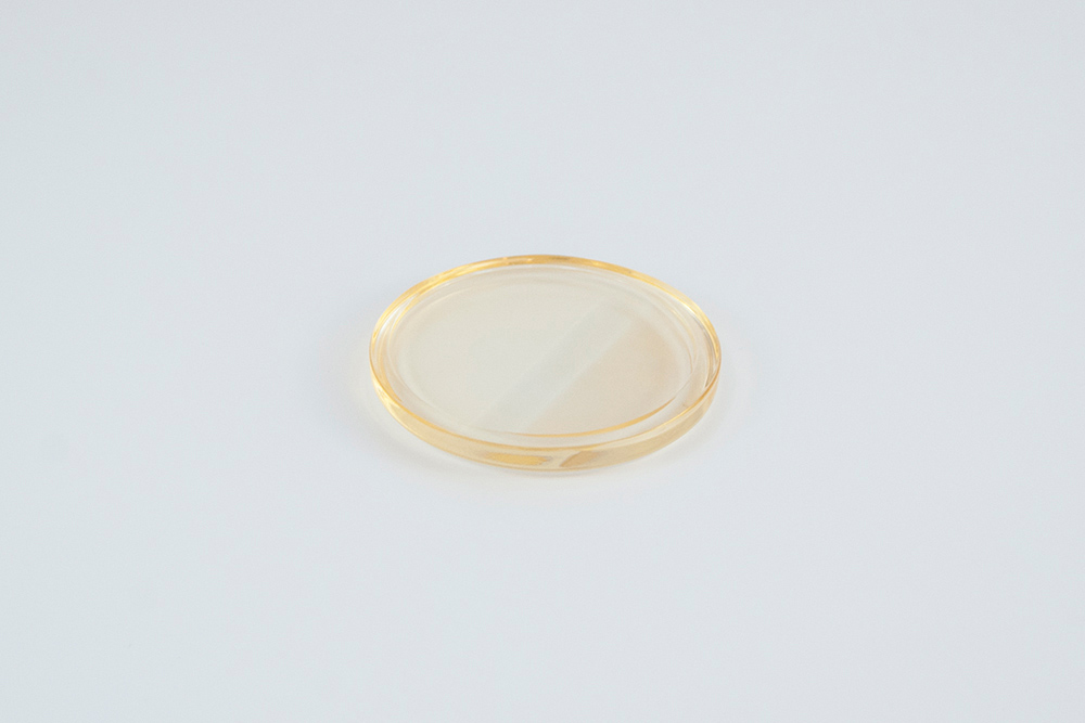
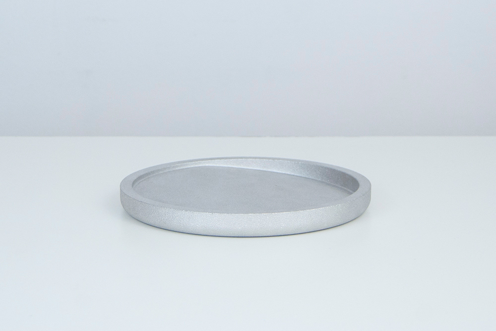
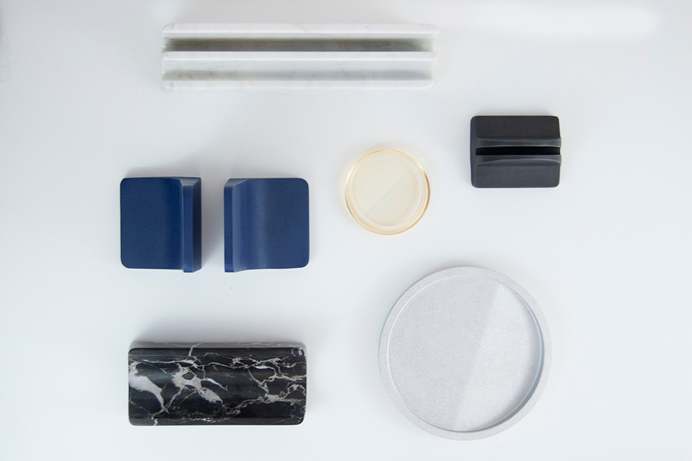
Kyuzo is a capsule collection of desk and home accessories, driven by materiality and designed to provide divisions of space through subtle hierarchies. Named after a character from Akira Kurosawa's 1954 epic "Seven Samurai”, the collection is by no coincidence comprised of seven objects.
The project is a meditation on formal purity and composition. The works within the suite are each made of a considered material coupled with an equally considered production method; the range includes cast iron, aluminum, wood, glass, and marble. While each component has its own strength, the grouping of objects is most balanced when viewed as a full set, each unit thriving on the sculpted language of another.
Each object satisfies a specific function for the desk and the home. The collection includes a paperweight which allots a space for more important documents, a two tiered folio holder, bookends, a tray for pens and pencils, and a dish with a sectioned slope, available in three sizes. While a primary use case has been established for each object, there's an openness that allows the objects to live and be used in a variety of ways.
-
Materials
Cast Iron, Cast Glass, Marble, Aluminum, Hard Maple Wood
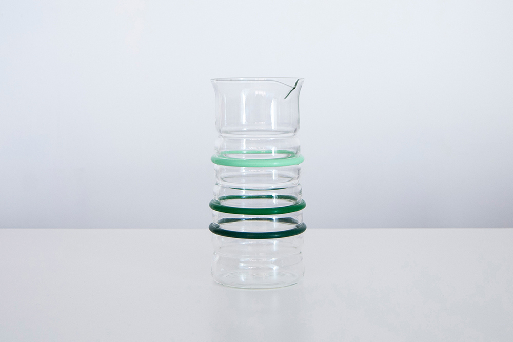
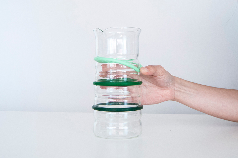
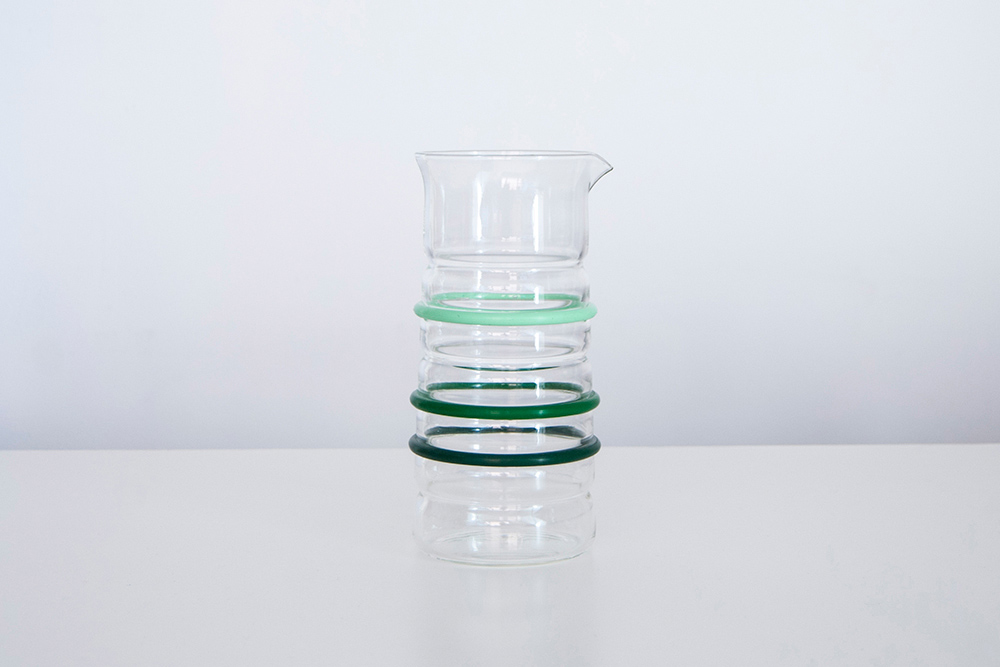
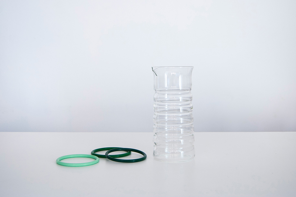
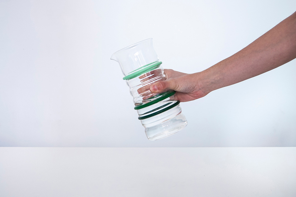
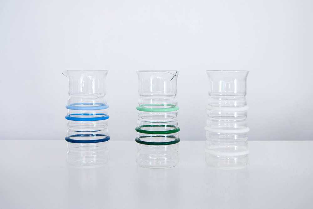
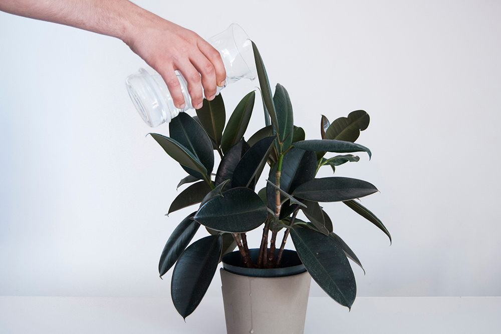
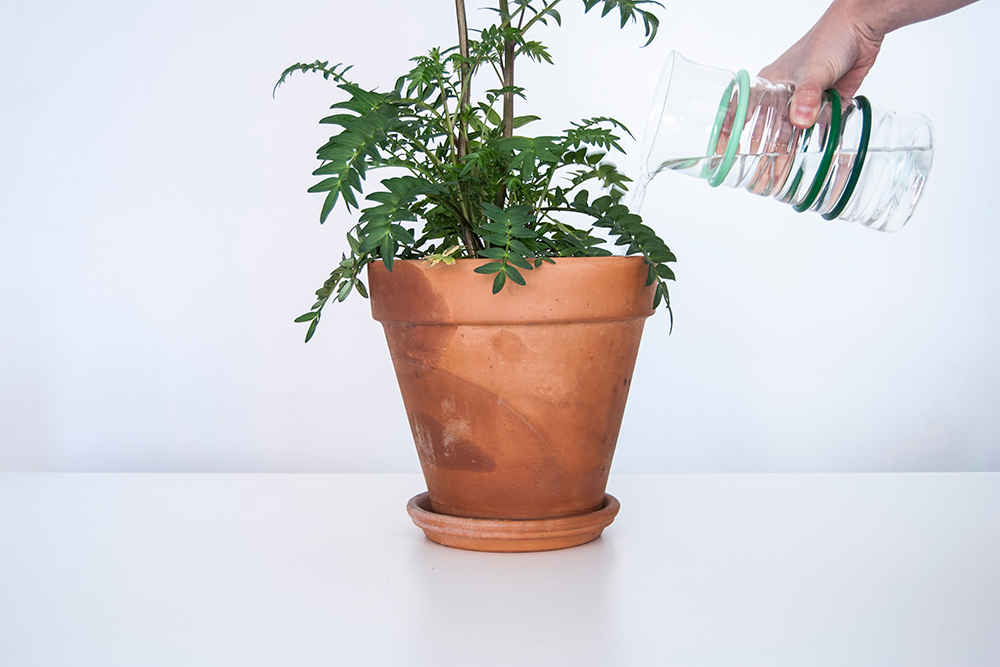

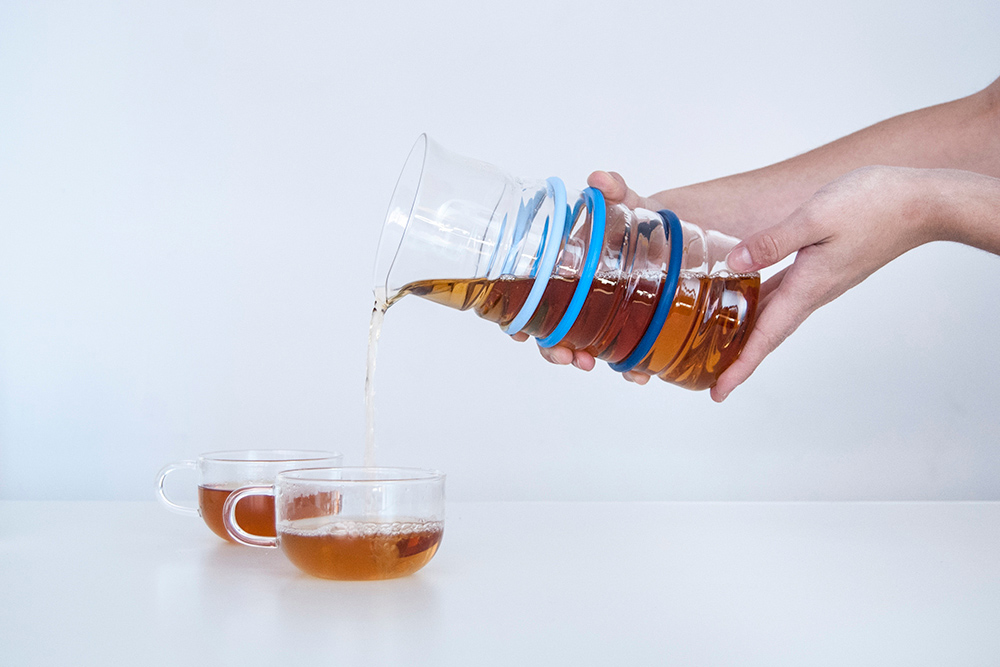
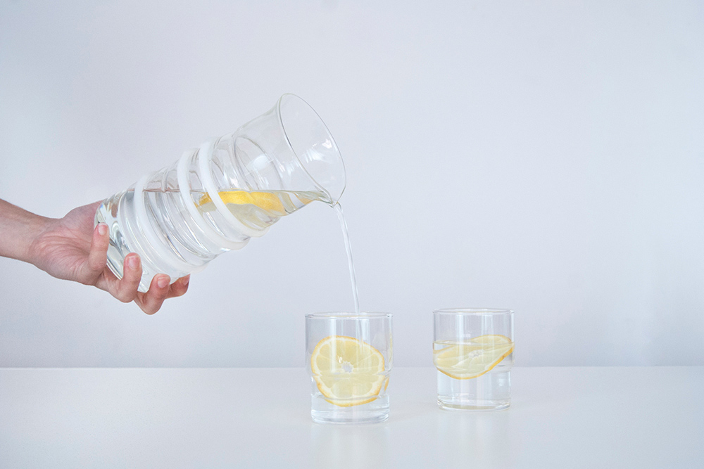

Life Measured Pitcher
-
Client
-
Development
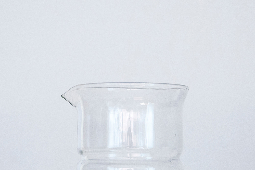
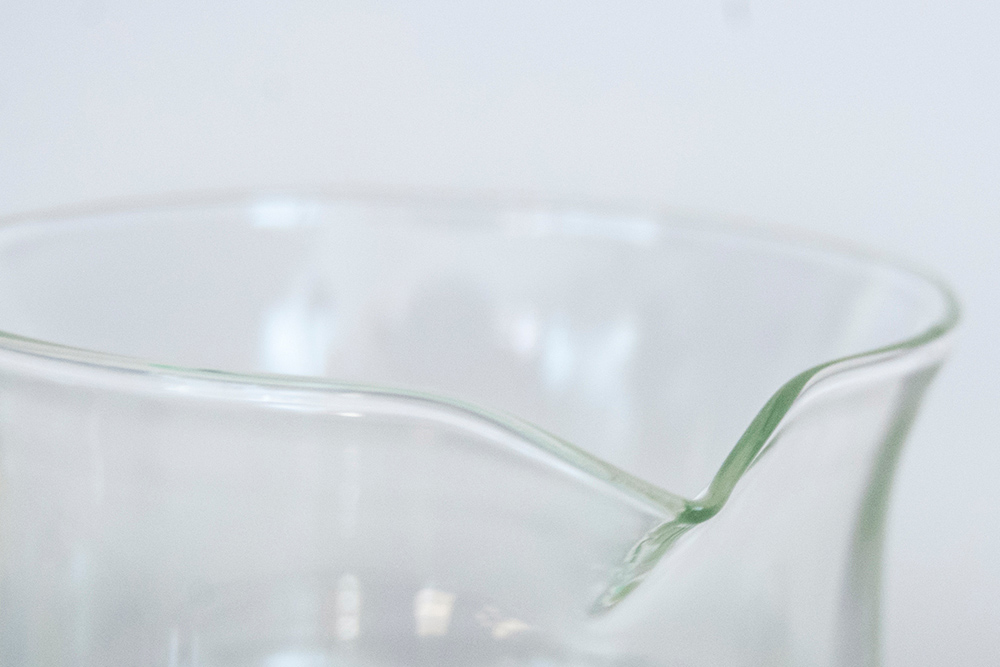
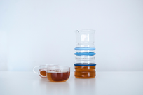
This pitcher incorporates the universal concept of measurements and brings them to a human level. The user’s daily idiosyncrasies are captured in a vessel which allows for adjustable measurements. The silicone rings can be moved to a desired height in order to indicate where one should fill to.
When watering plants, each ring could signify a different plant in the house and how much water they need. When mixing drinks, each ring can indicate an ingredient. Additionally, the silicone rings act as convenient grip throughout the day-to-day routine.
-
Materials
Borosilicate Glass, Silicone
Duo
-
Client
-
Development
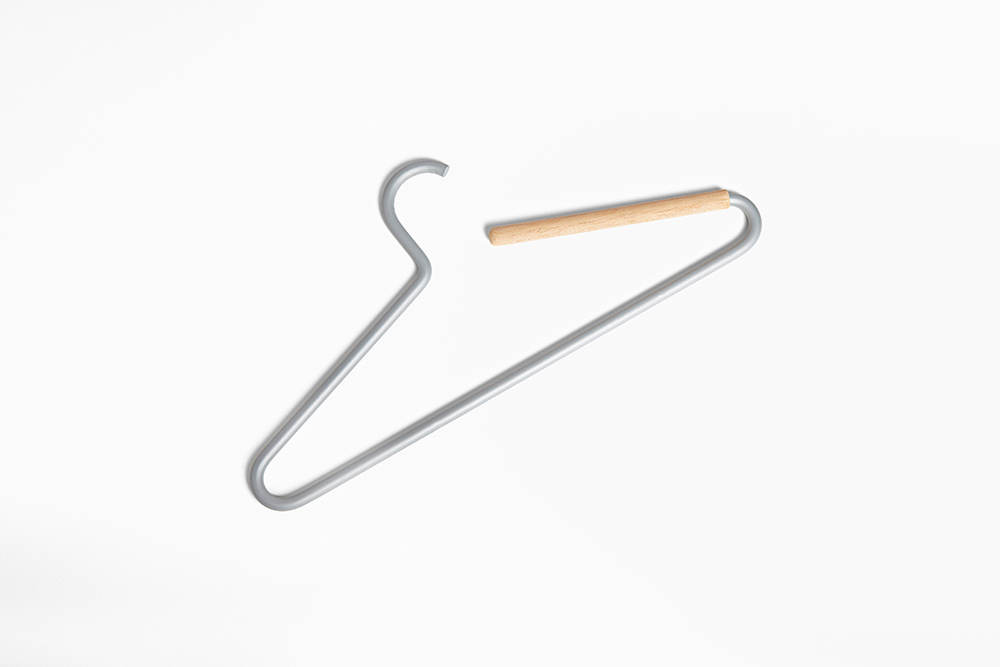
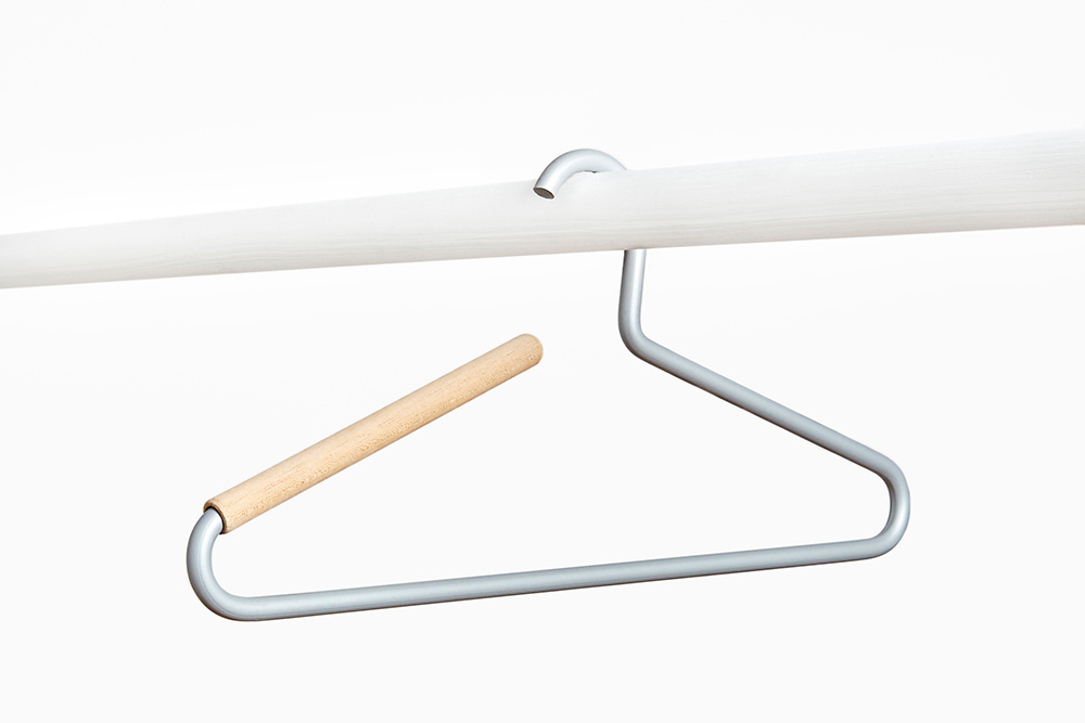
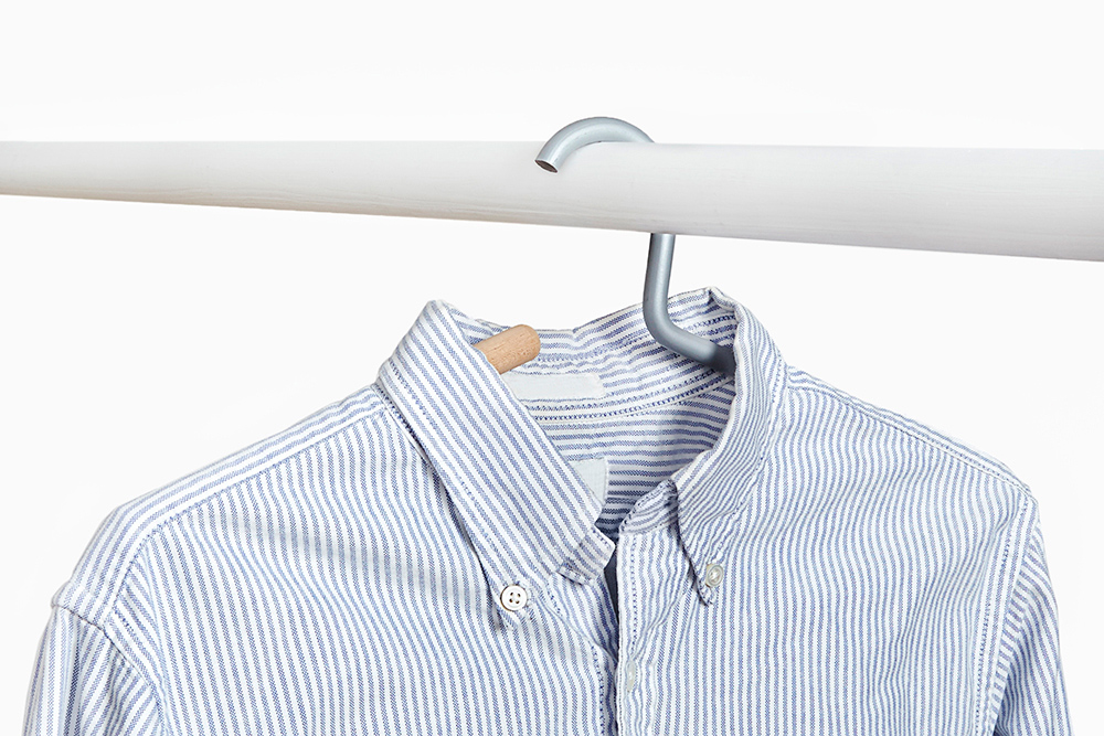
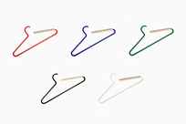
Employing aluminum and cedar wood for their sophisticated material properties, Duo uses the language of a continuous line, allowing metal to transition seamlessly into wood. The fragrance of cedar naturally repels insects while keeping your garments fresh. The aluminum is robust yet light, giving the object a playful confidence. These materials combine a new world material with an old world one to make a better hanger, an innovative form that still feels familiar, a new classic.
-
Materials
Aluminum, Cedar Wood
Shapes Bundle
-
Client
-
Development
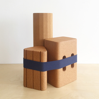
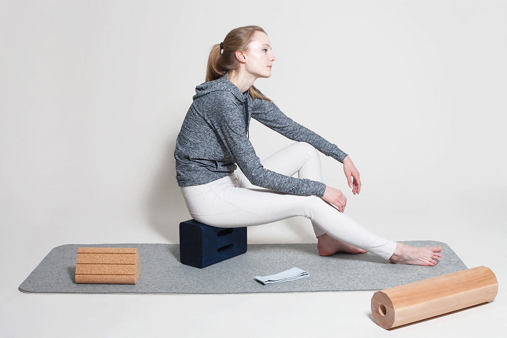
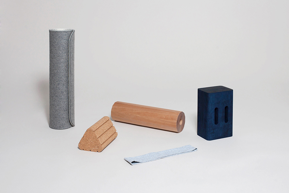
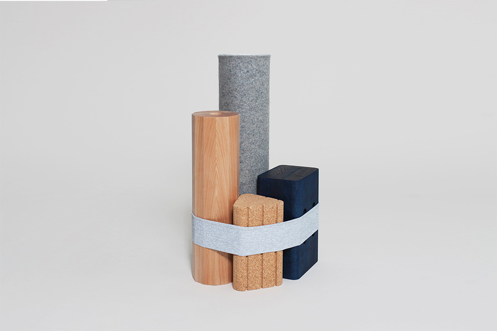
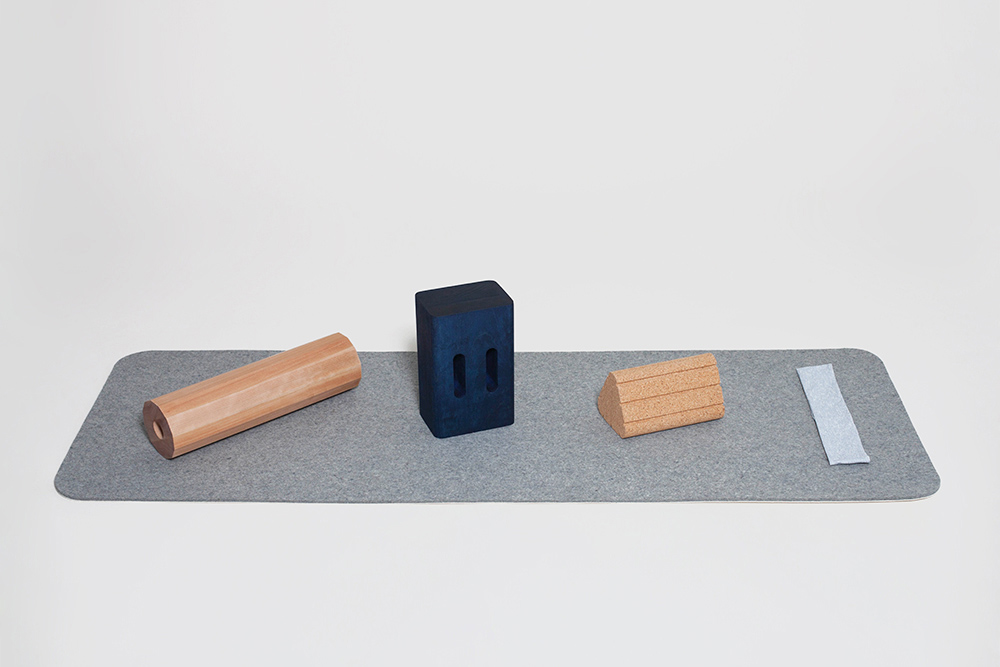
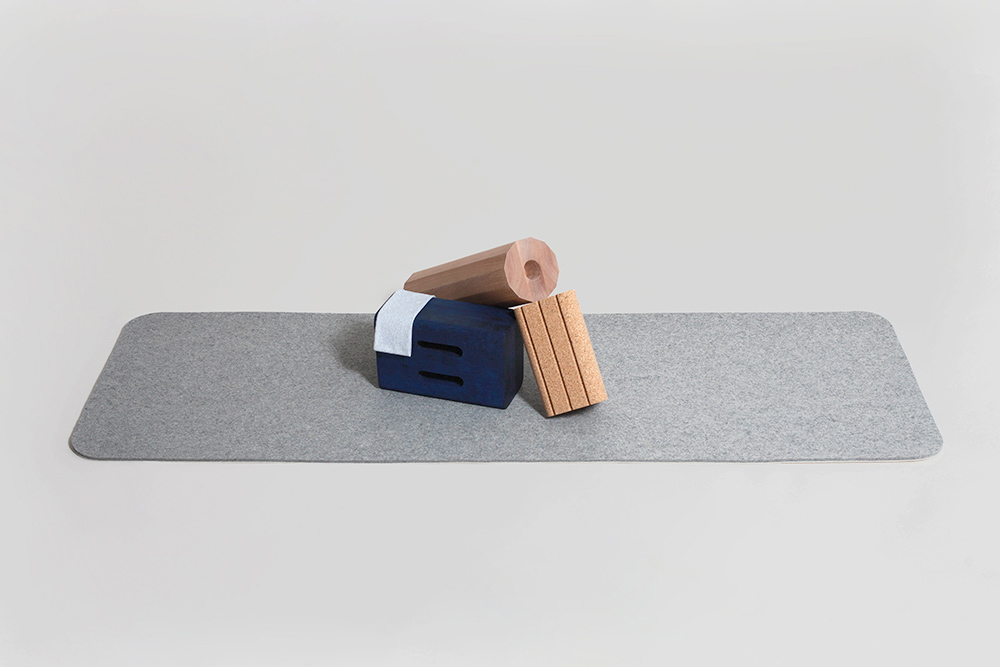
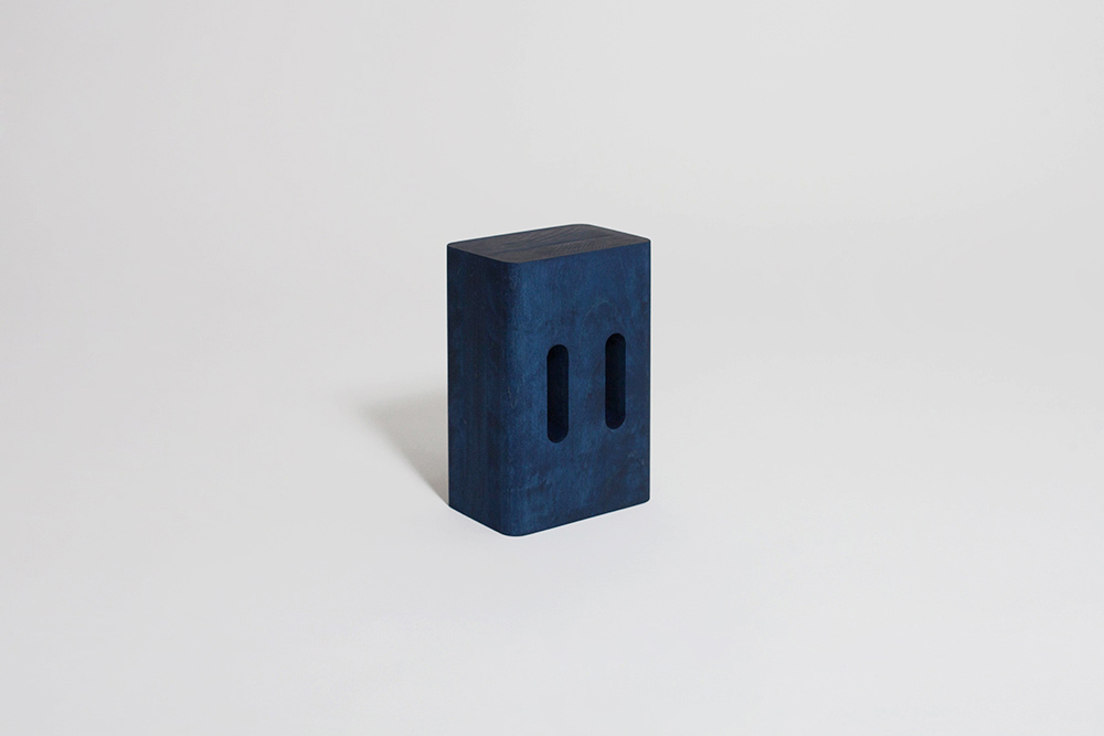
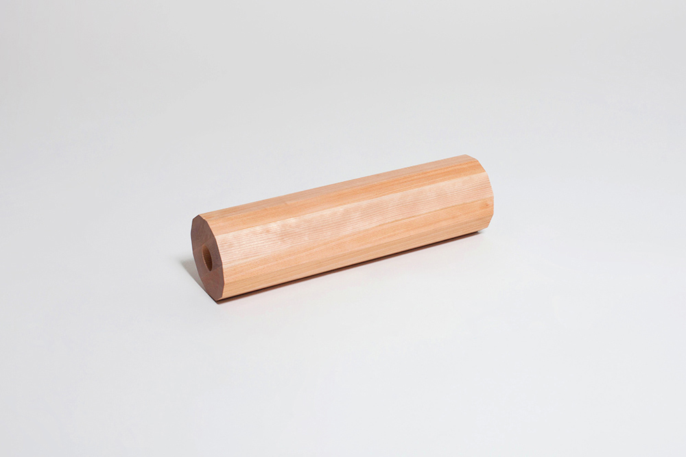
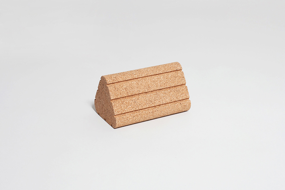
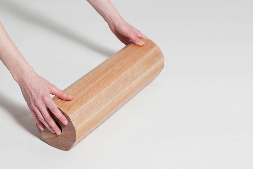
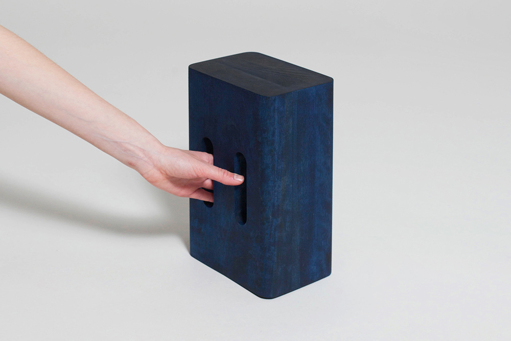
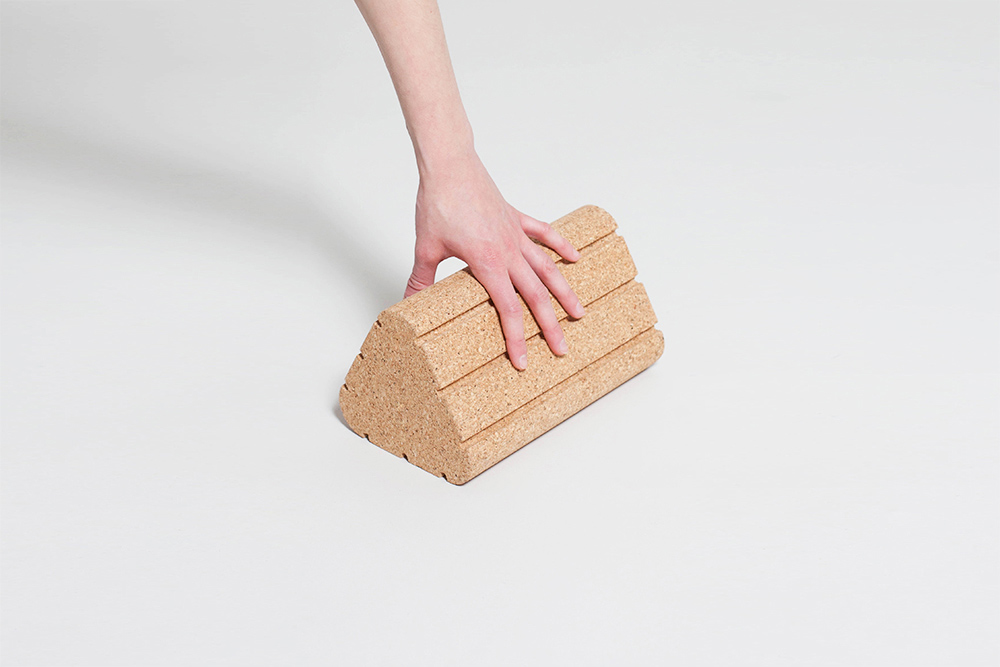
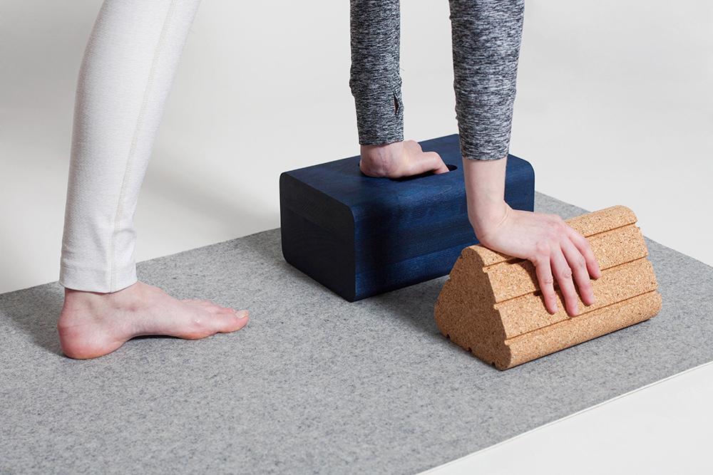
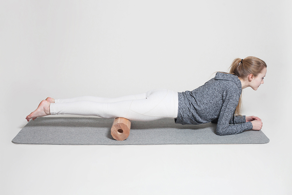
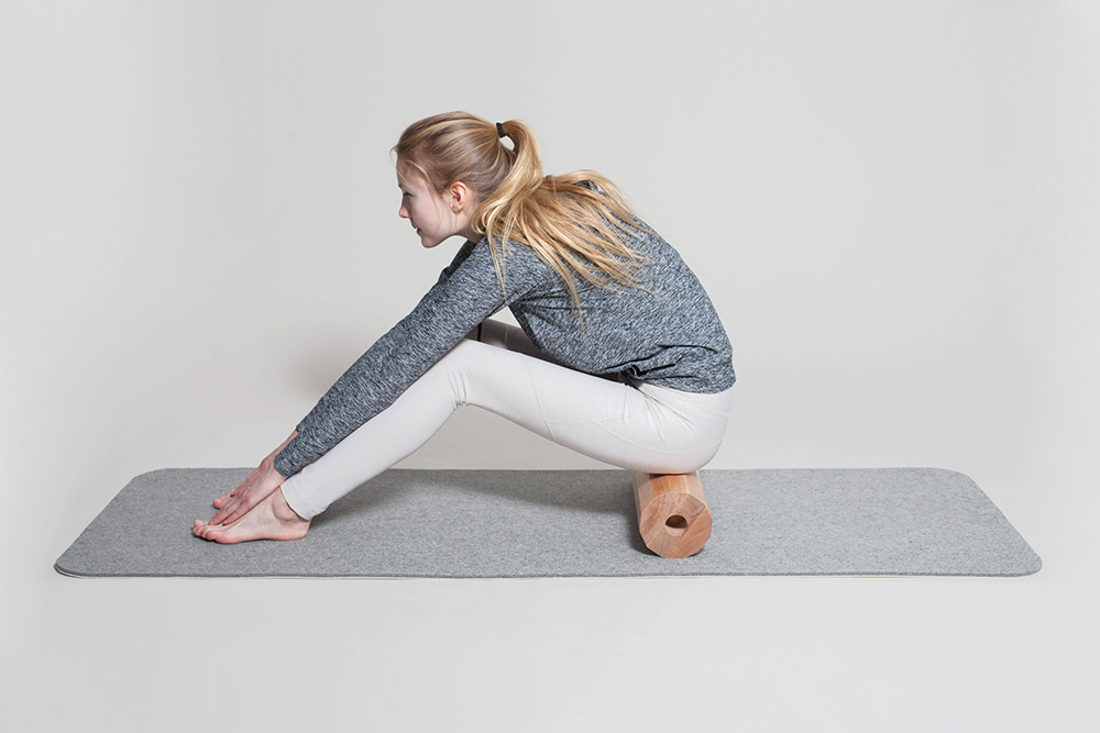
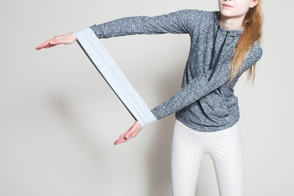
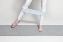
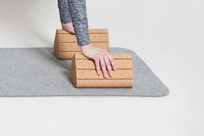
For the Wallpaper* Handmade project in 2015, Visibility was partnered with Outdoor Voices, a recreational apparel brand based in New York. Together we found an exciting opportunity to play with form, color, and material, creating a family of five objects made of natural materials and intended for use both within and outside the realm of yoga. These fitness-related objects, commonly hidden away or relegated to a space outside of everyday living, seek to bring warmth to a domain that can often come across as sterile or unconsidered. Included in the set is a resistance band, a wood yoga block, a triangular cork block, a wood roller, and a felt mat.
The objects themselves employ a diversity of forms allowing for a variety of different exercises. They reference typical fitness products but leave the use cases pleasantly open, encouraging the user to find new ways to interact with them. The forms humbly fit together in a bundle, in a playful composition of materials and color, held together by a fabric resistance band. The dyed wooden block works similarly to typical yoga blocks, with a handle that has been added for carrying and performing additional poses. The birch roller is 12-sided with hole details on the side for carrying and for rolling. The cork triangular block has grooves for grip that fit comfortably in the hand. The mat is laminated from two different sheets of natural felt; the surface a softer felt for cushioning, and the bottom a harder felt for gripping the floor.
The project was exhibited at Wallpaper* Handmade in Milan, 2015.
-
Materials
Birch Wood, Cork, Felt, Performance Fabric

Auction Kiosk
-
Client
-
Development
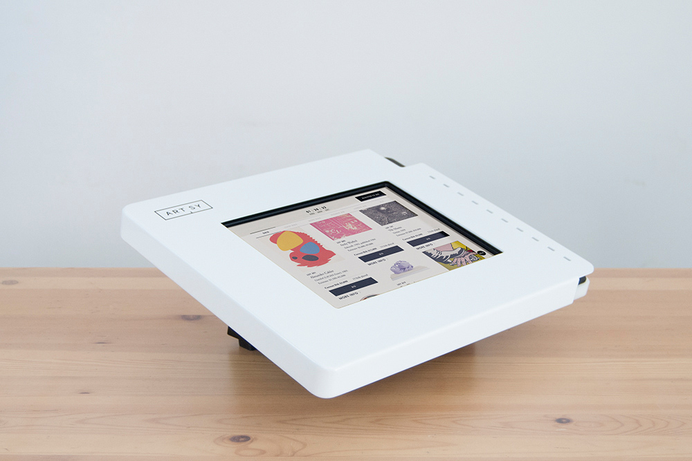
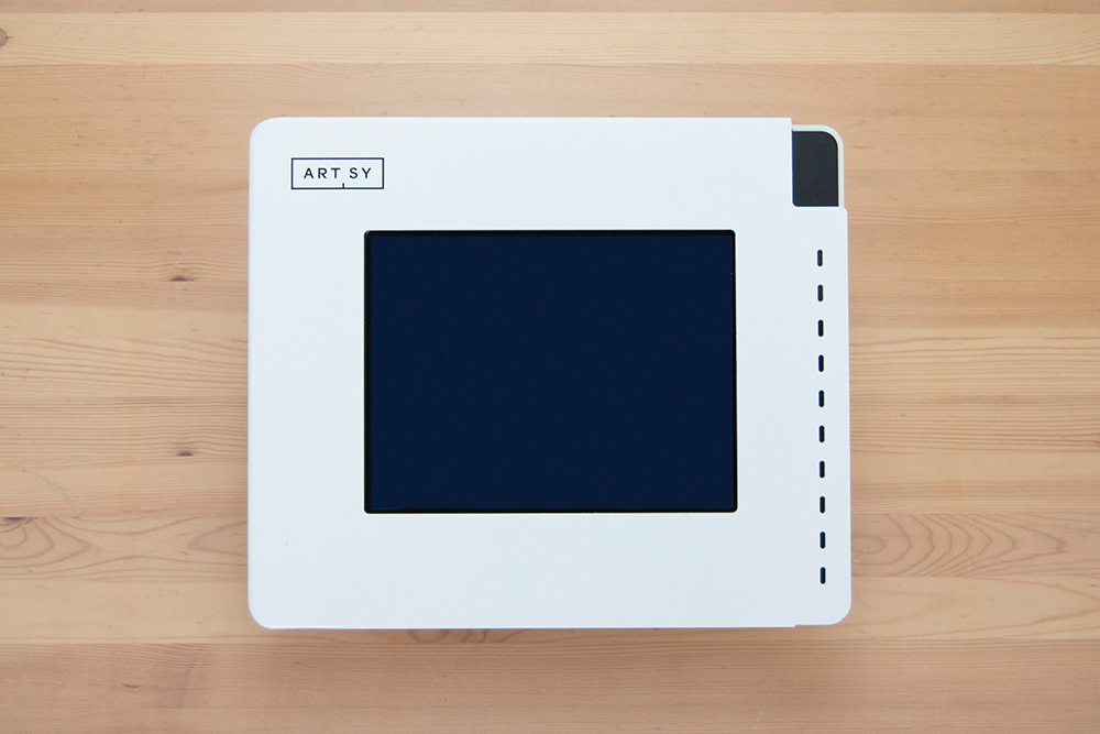
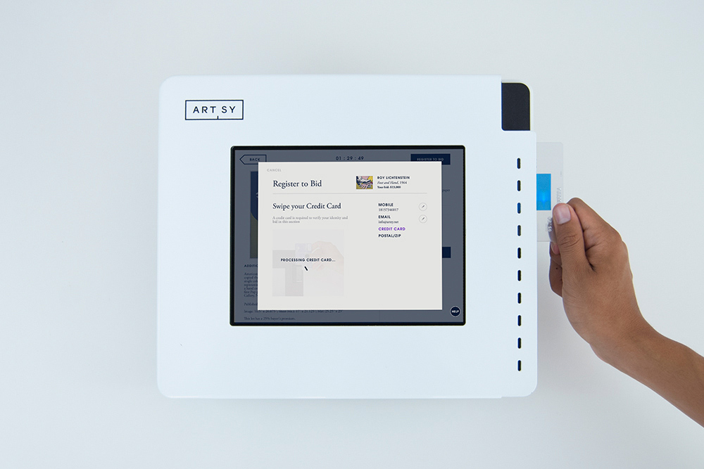
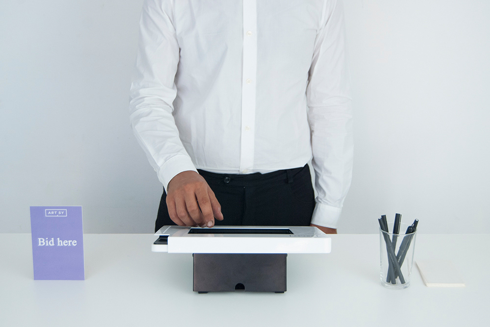
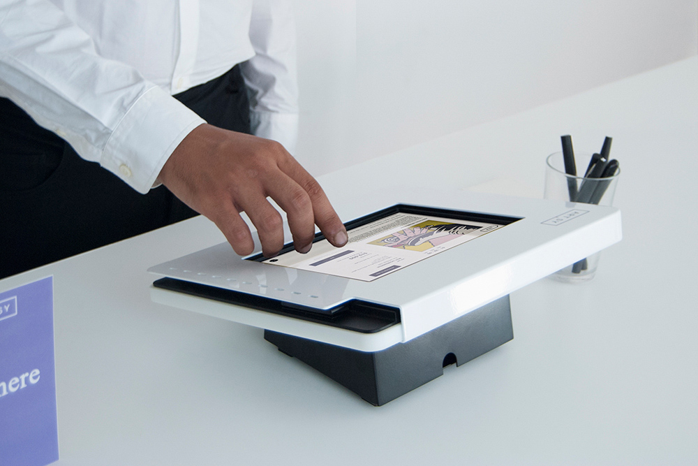
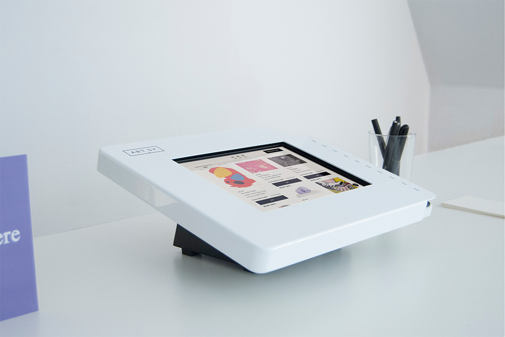
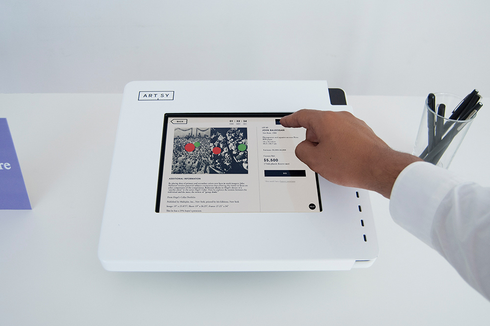
A kiosk designed to facilitate browsing and bidding at Artsy's auction events. The kiosk accommodates an iPad to display Artsy's auction app, where users can explore available works, register to bid, and submit payment details by swiping a card along the perforated side of the kiosk frame. The perforated holes suggest the function of swiping and the idea of motion.
-
Materials
Steel, Hardware
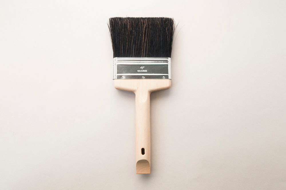
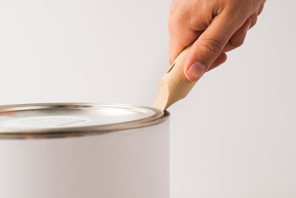
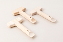
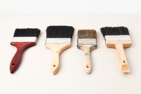
Standard Paintbrush
-
Client
-
Development
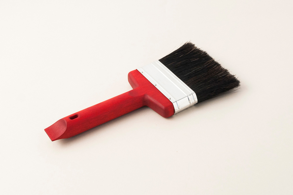
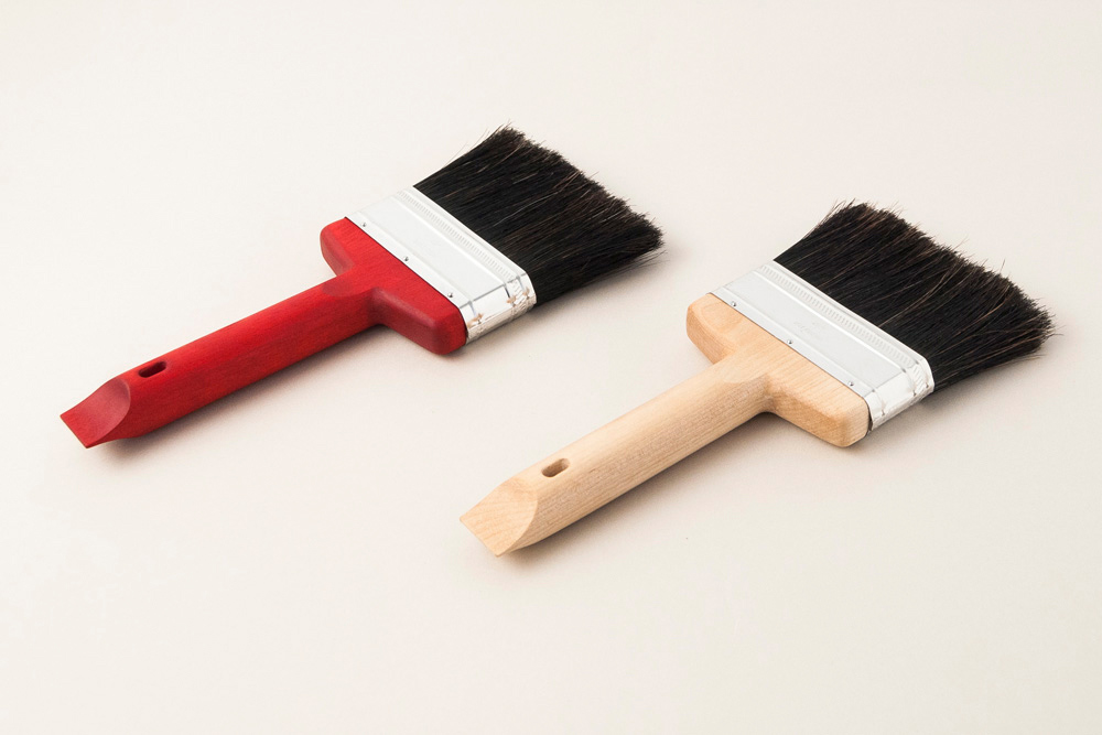
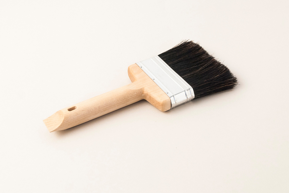
We were asked by SHOP Cooper Hewitt, Smithsonian Design Museum to design a tool for sale to coincide with the museum's show "Tools: Extending Our Reach". In response to this prompt, we approached the classic paintbrush.
Working with a paintbrush manufacturer and a CNC shop, we were able to develop a machined wood paintbrush that is a useful progression of the archetypal paintbrush one would find at a local hardware store. The sculpted end allows it to open paint cans, so that the painter can get to work right away. The body is shaped so that one can comfortably hold the brush in a variety of painting and opening positions.
The Standard Paintbrush is produced in a limited run, created exclusively for SHOP Cooper Hewitt, Smithsonian Design Museum.
-
Materials
Birch Wood, Ox Hair Blend Brush
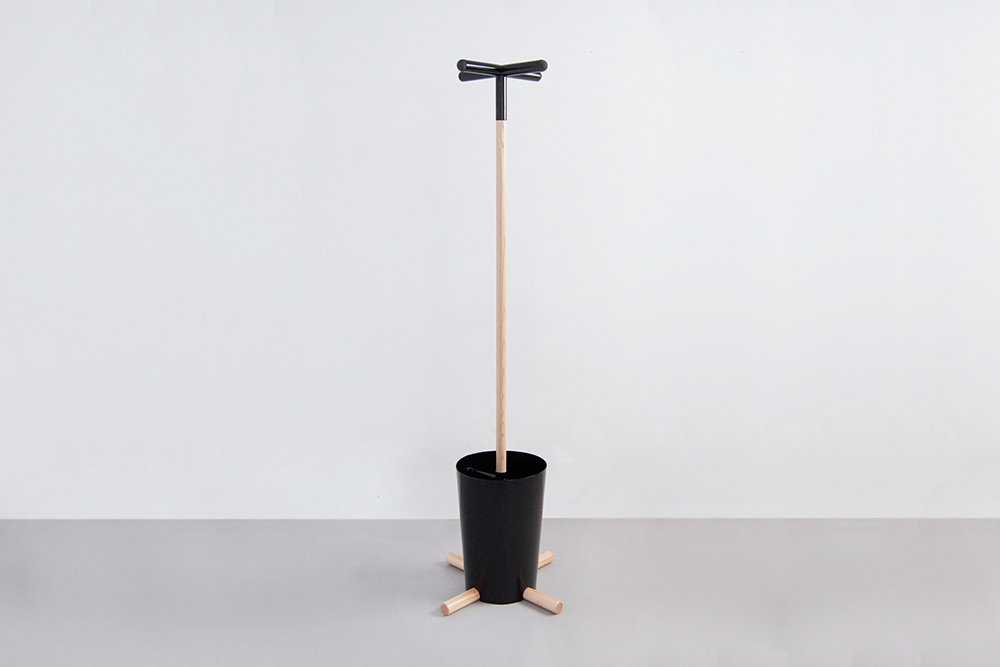
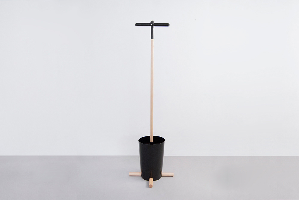
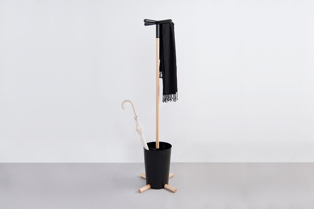
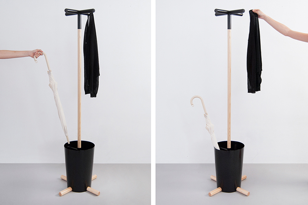
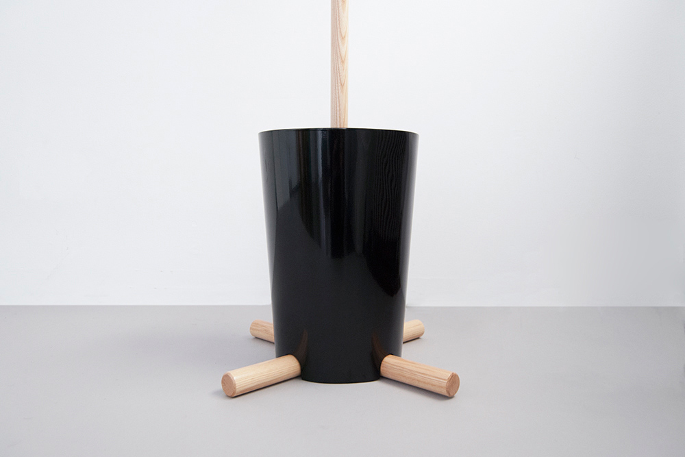
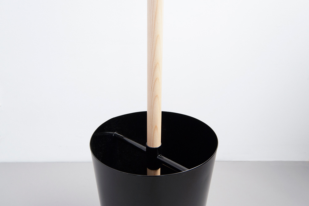
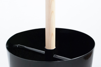
Plus Coat Stand
-
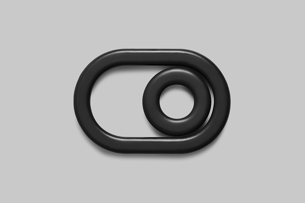
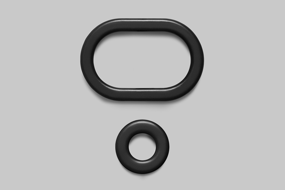
Development
The Plus Coat Stand uses the iconography of the '+' and the 'o' signs to hang and to hold one’s coats and umbrellas. This object simplifies the process of arriving home, allowing for one place to gather one’s belongings. In the same way that the '+' and the ‘o’ work together, so do the materials. The wood, steel and rubber form an efficient structure allowing for lightness to combine with usefulness. The horizontal ‘+’ at the top uses rubber caps to ensure that garments stay on, deviating in form from traditional hook employing coat stands. This innovation to the archetype creates a product with new usefulness and value.
-
Materials
Steel, Wood, Rubber
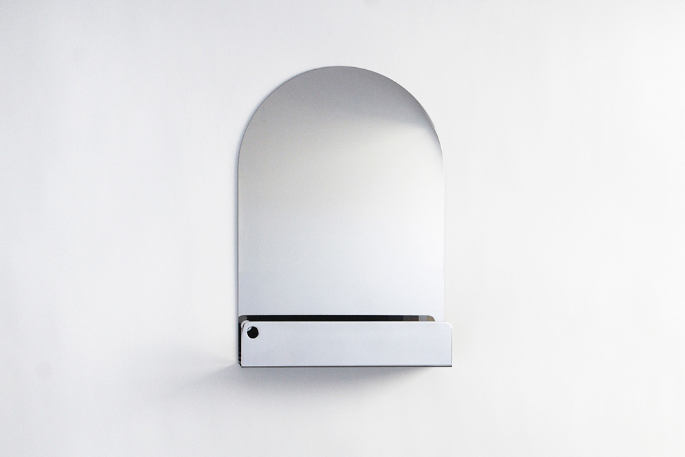
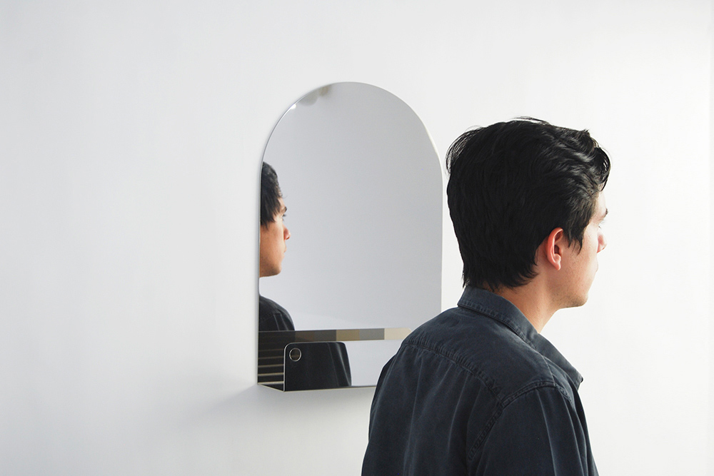
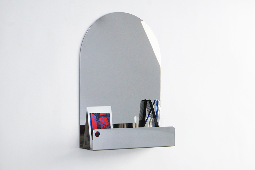
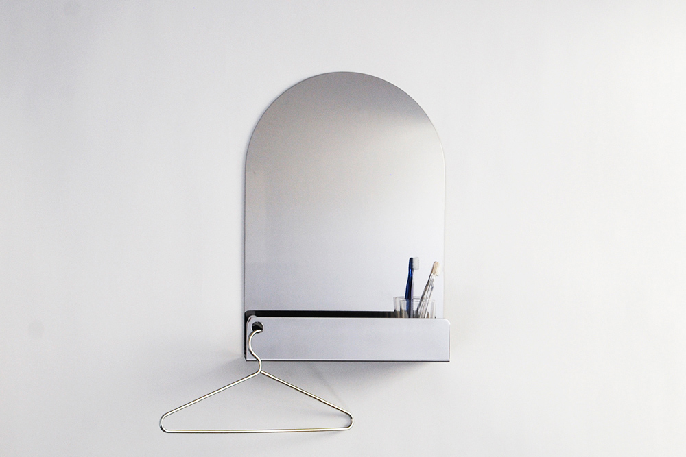
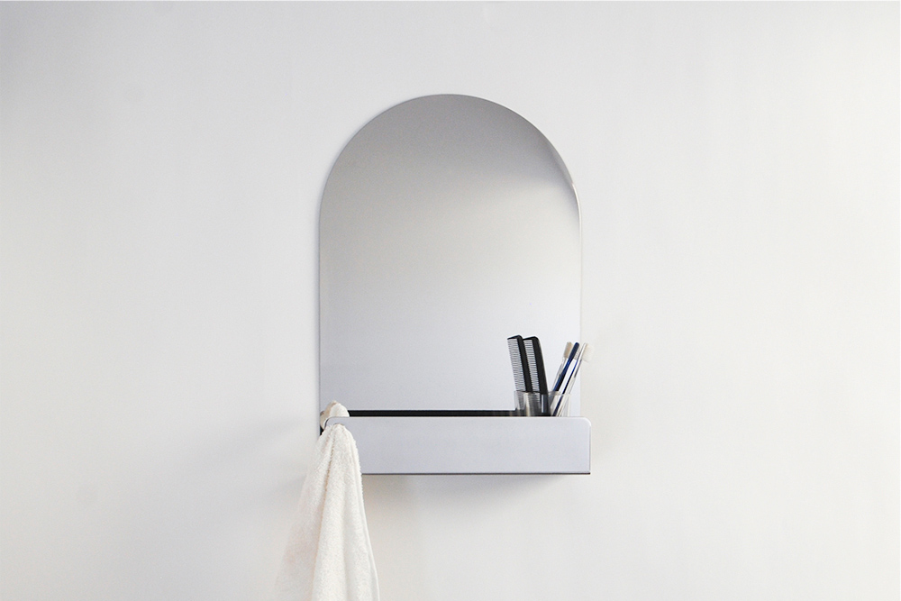
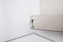
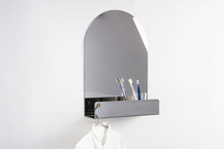
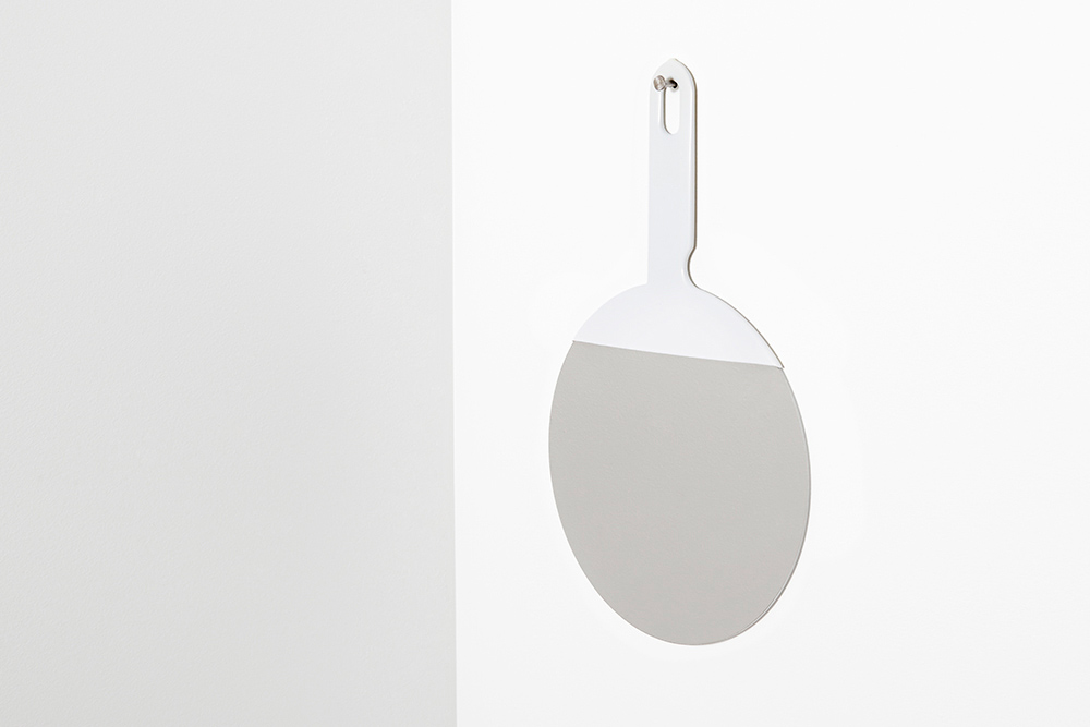
Arc Mirror
-
Development
The Arc Mirror is an object as intimate as the action it implies. It reflects the user while holding the objects that are part of the daily ritual. These objects are then emphasized by their own reflection which appears crystalline in the shelf space. The mirror displays an authentic materiality, allowing the stainless steel to become both reflective and structural. The hole can receive a coat-hanger or towel, and the mirror itself mounts with a simple bracket.
-
Materials
Stainless Steel
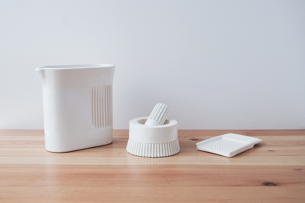

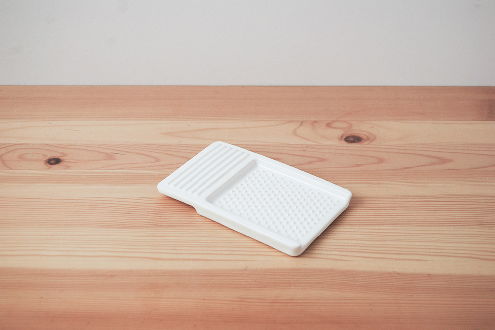
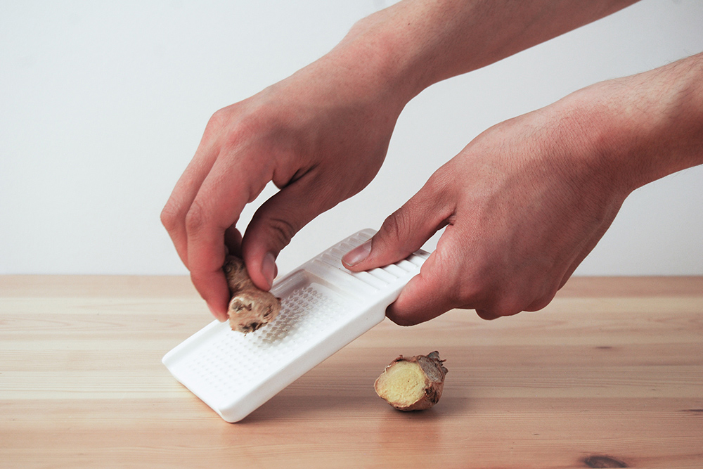
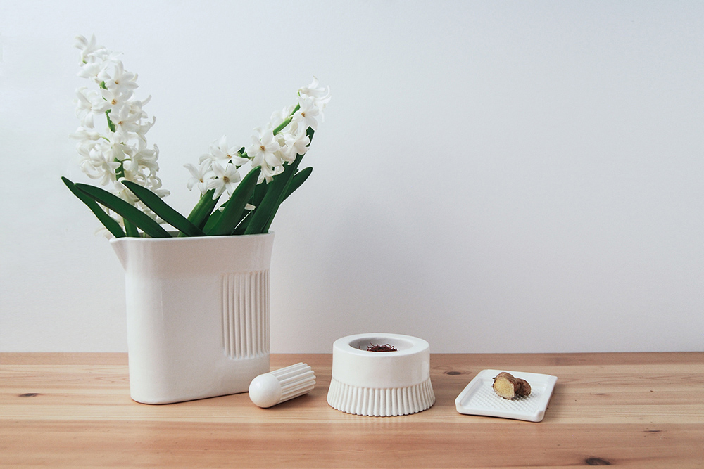
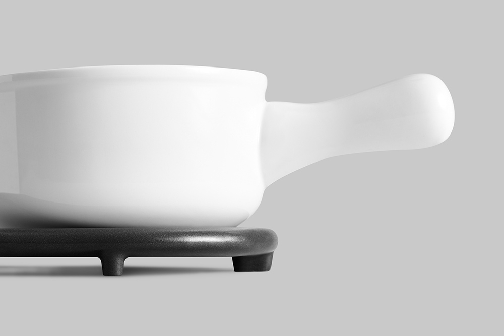
Ridge Kitchen
-
Development
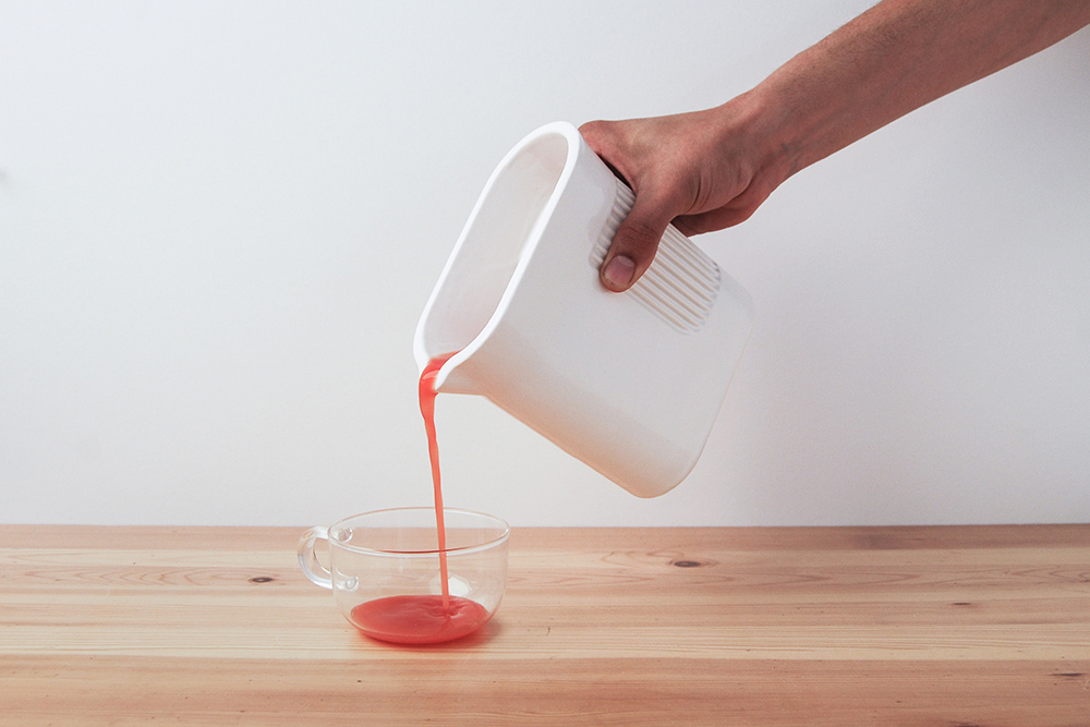
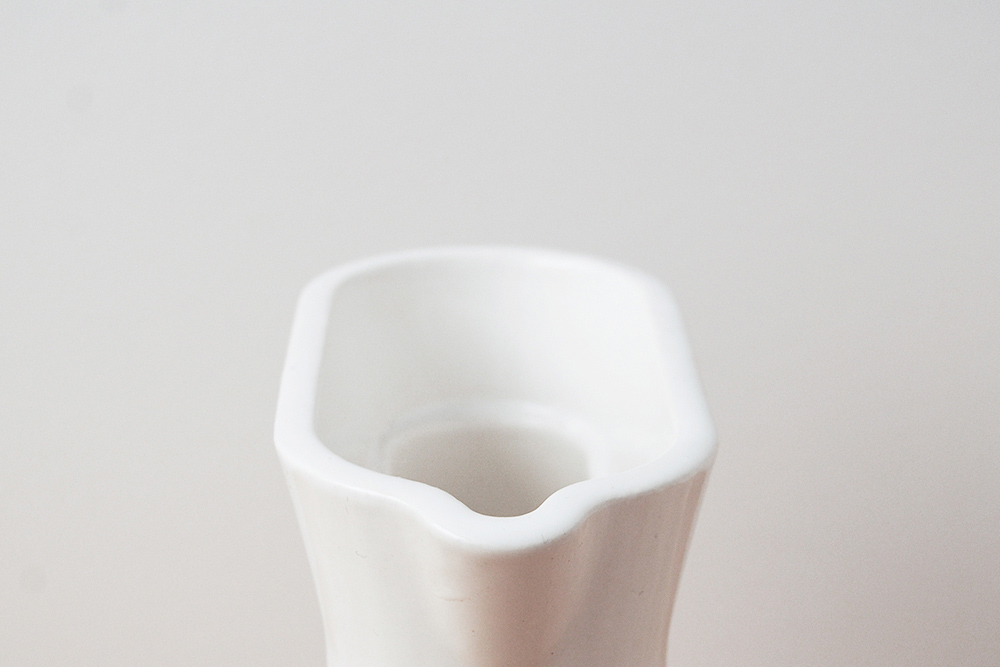
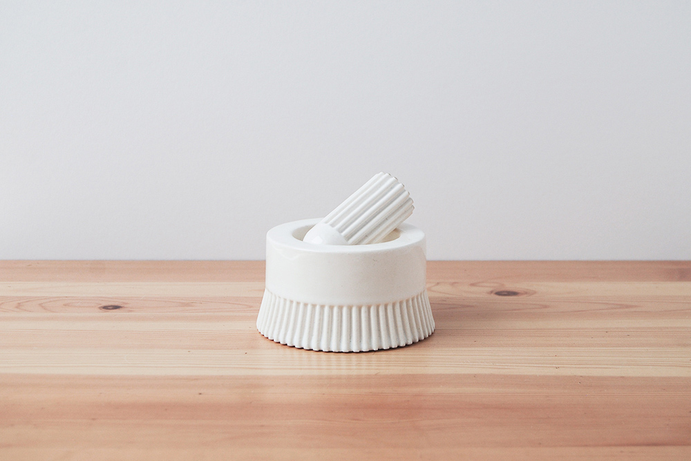
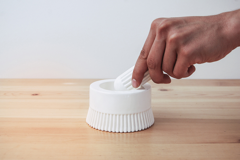
Ridge Kitchen is a collection of porcelain tools for the kitchen. Made from a material true to the landscape of the kitchen, the surface conveys use through pattern and motion. This pattern acts as a visual and physical grip. The forms reference the language of the machine while being implemented into traditional kitchen products. These objects want to be as charming as they are useful.
The pitcher serves two cups of liquid. The grooves on the mortar and pestle are perfect for the twisting motion required in grinding. The grater is specifically meant for ginger and garlic, modeled after traditional Japanese porcelain graters.
-
Materials
Porcelain
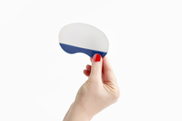
Utility Mirror
-
Client
-
Development
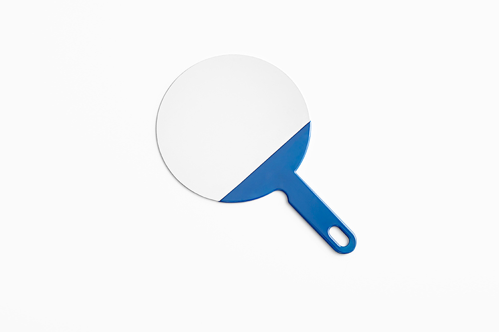
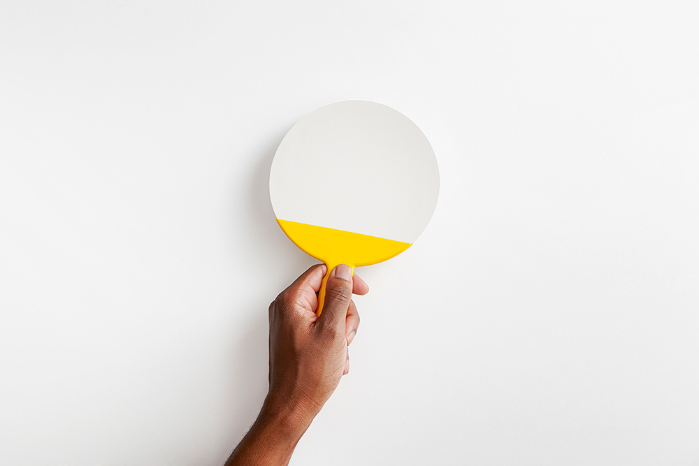
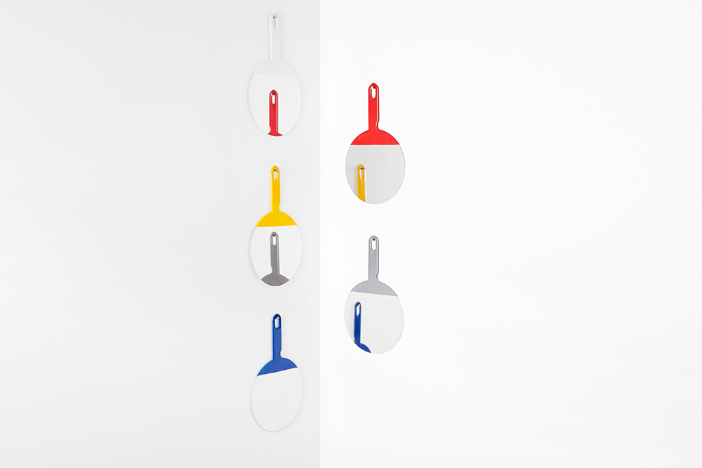
The hand mirror is innately a personal object. One will always use this object alone, allowing them to appreciate it with each use. Glass mirrors are ephemeral in nature; by making the surface stainless steel and the handle rubber, the mirror speaks the language of utility and encourages use.
The Utility Mirror is made by polishing a piece of stainless steel to a perfect mirror finish and dipping it in industrial rubber tool grip.
Images courtesy of Alyssa Kirsten.
-
Materials
Stainless Steel, Rubber
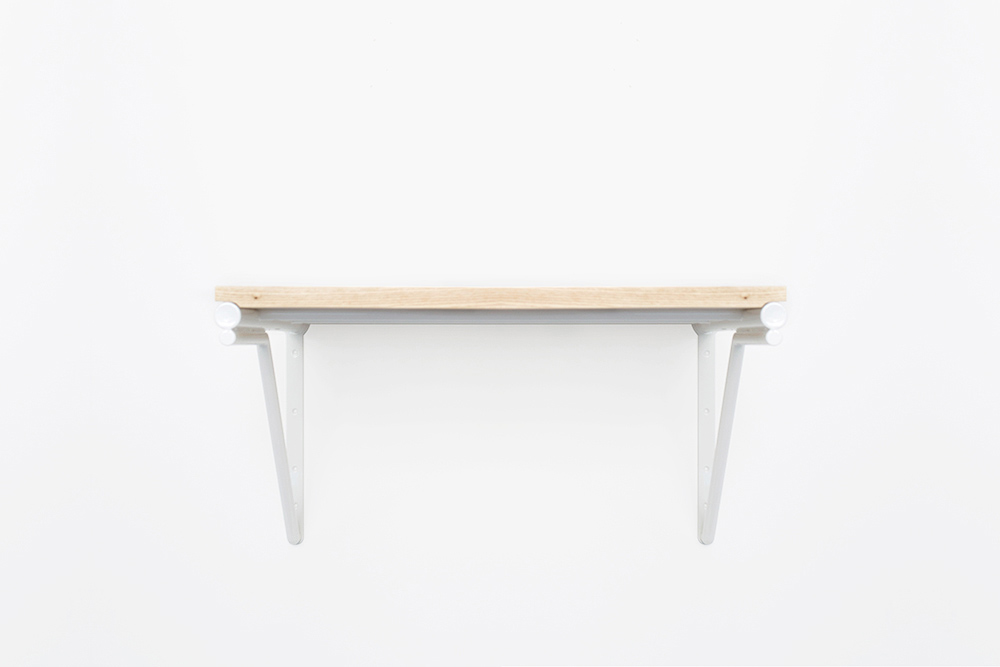
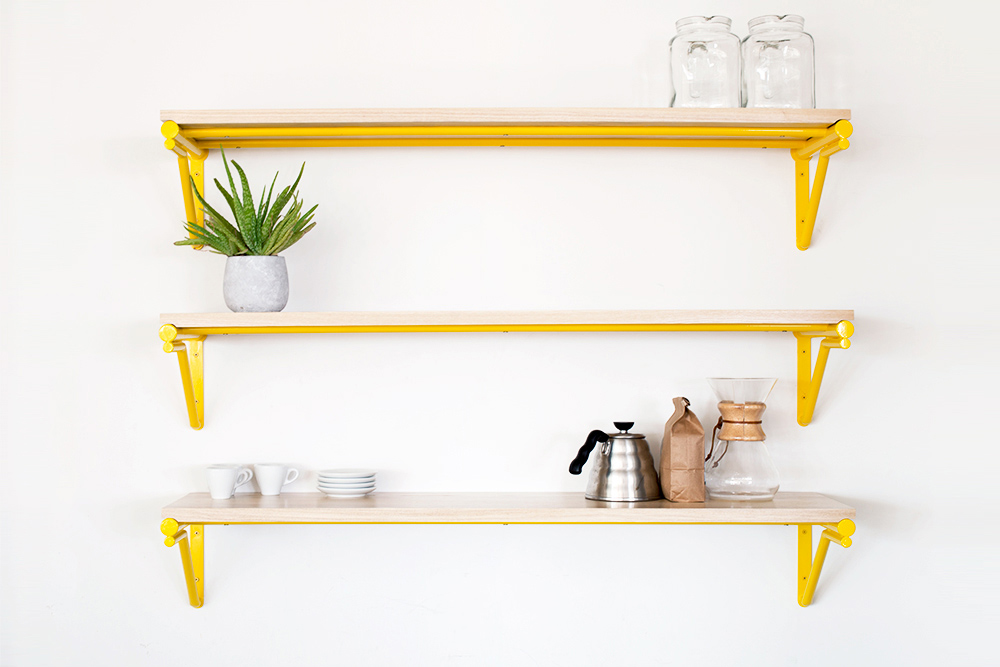
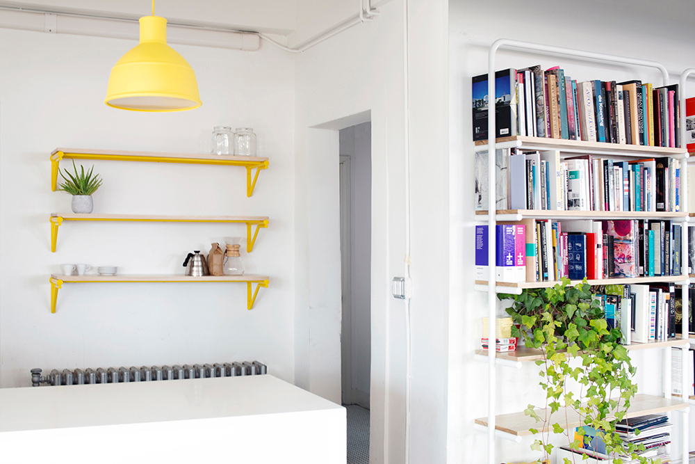
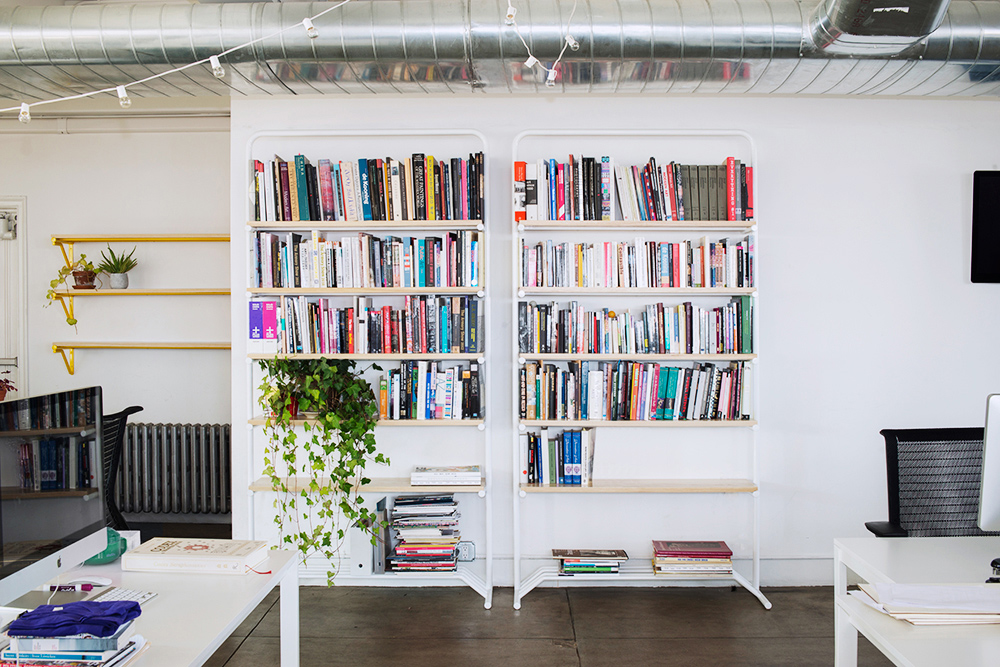

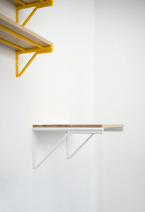
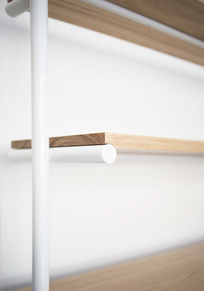
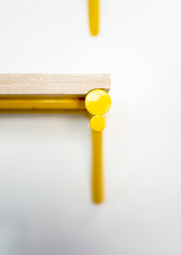
Linework System
-
Client
-
Development
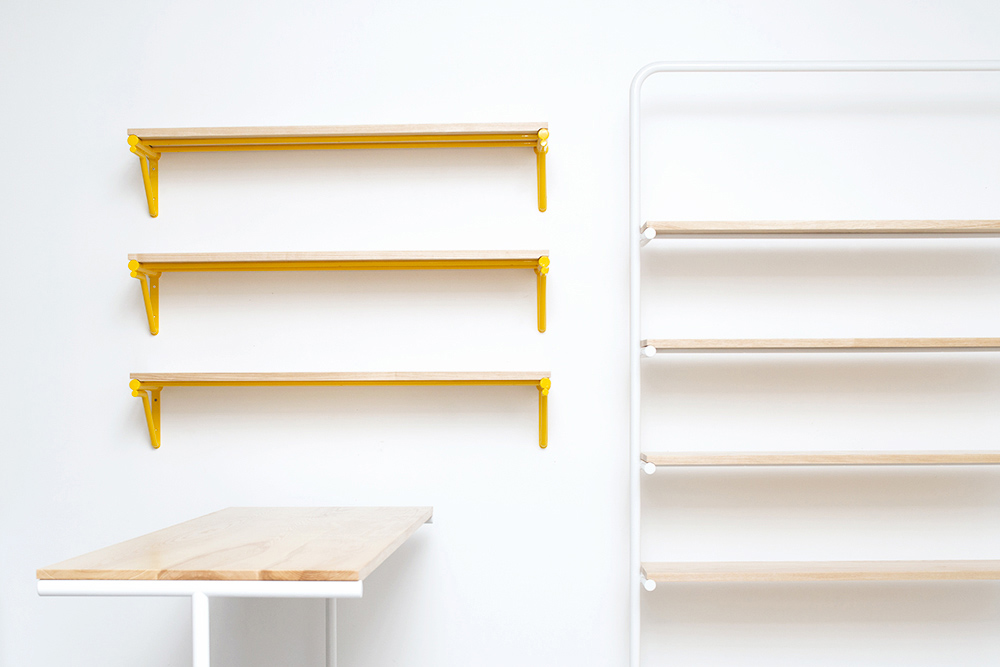
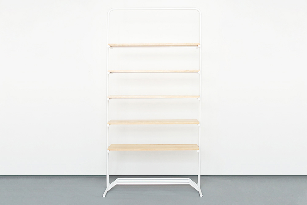
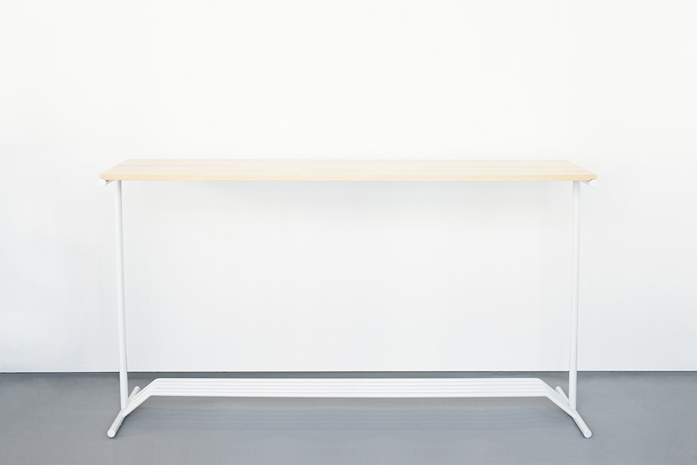
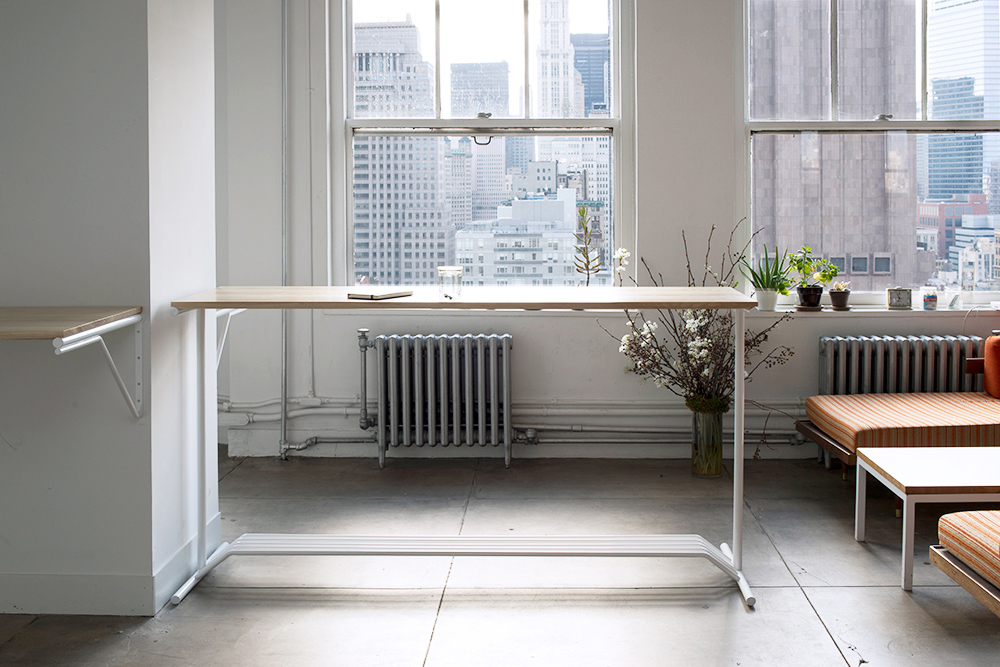
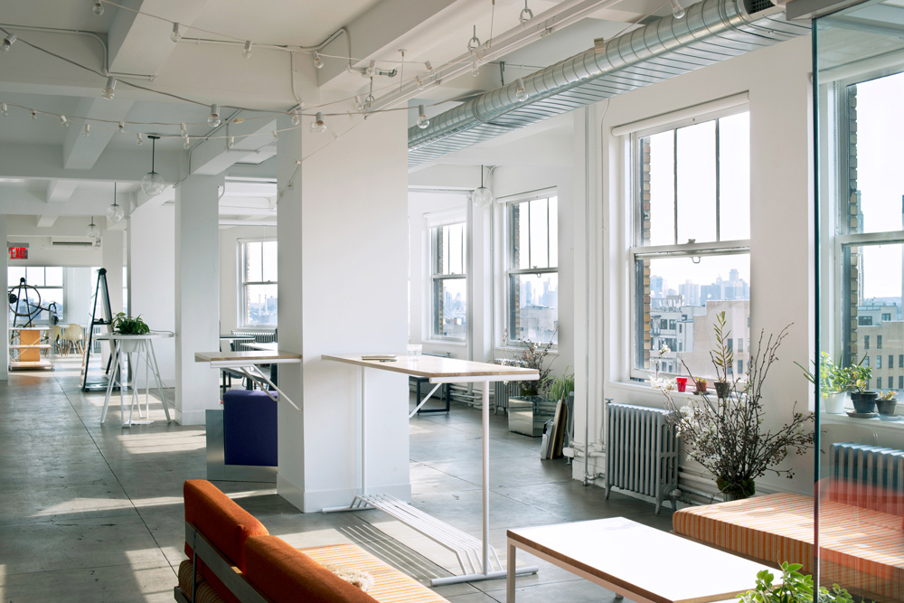
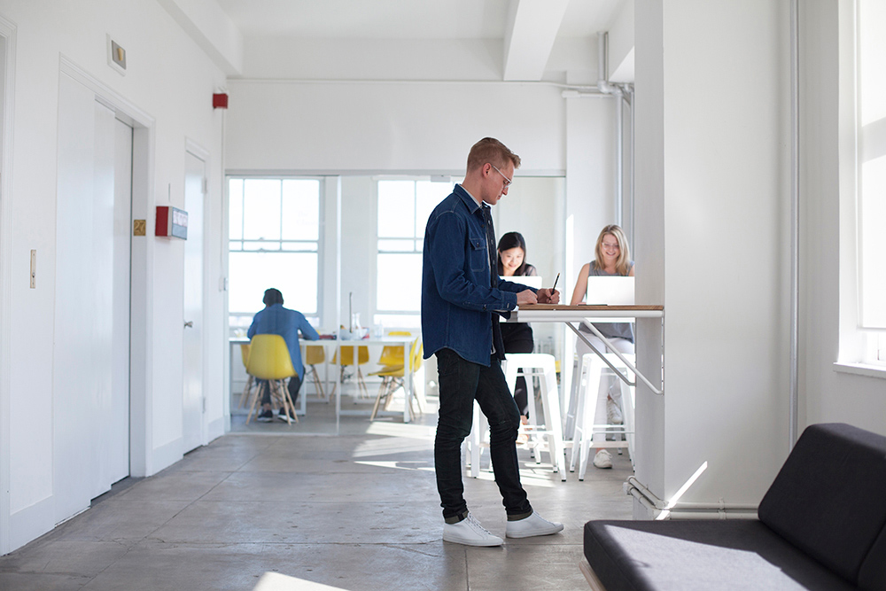
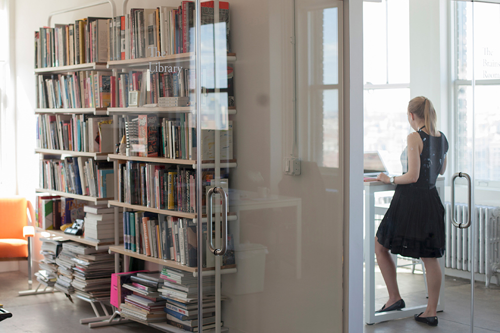
Furniture system designed for the central offices of Artsy, an online platform for discovering and collecting art. The objective was to design an office system that would allow for versatile storage as well as collaborative and personal work surfaces.
Shelving holds the objects that we want out of the way, but available for continued use and on display for the convenience of others. When the structures that hold up our possessions utilize lightness, those structures allow the objects to speak for themselves and to communicate their meaning to the users.
The Linework system elevates the objects that one chooses to fill the spaces with. The shape of the bookshelf frames the items which live in the space it creates. The shelving and desks derive functionality from linear elements combined with minimal surfaces in an efficient way. Less material creating an aesthetic and utilitarian impact.
The desks are at various standing heights to provide a break from the traditional sedentary office culture. The free standing desk, as well as the bookcases, have a raised shelf below for storage of bags and personal items. This provides a space for objects that do not belong on the ground or the work surface. The spacing of the shelves on the bookcases are enlarged to allow for Artsy's extensive collection of art books.
Images courtesy of Nick Simmons & Gregory Cartelli.
-
Materials
Ash Wood, Tubular Steel
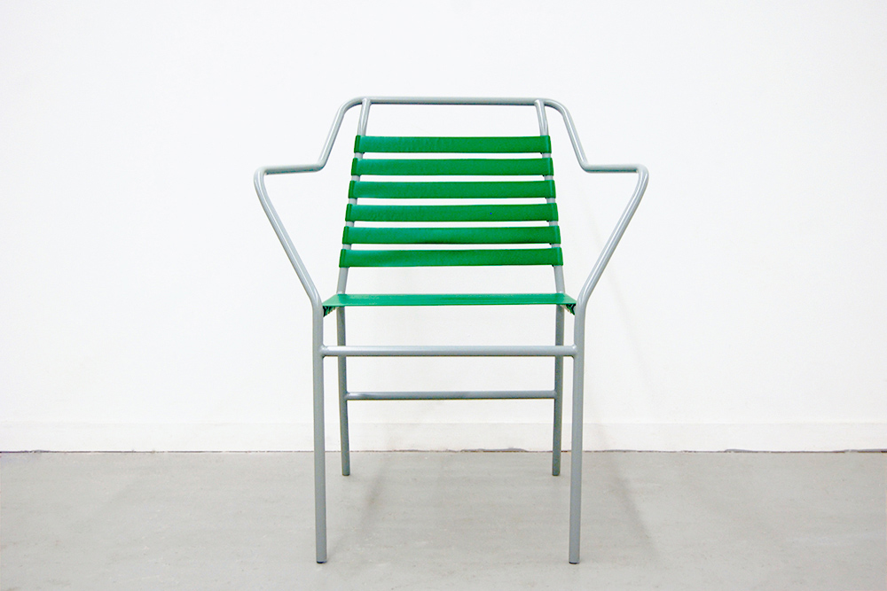
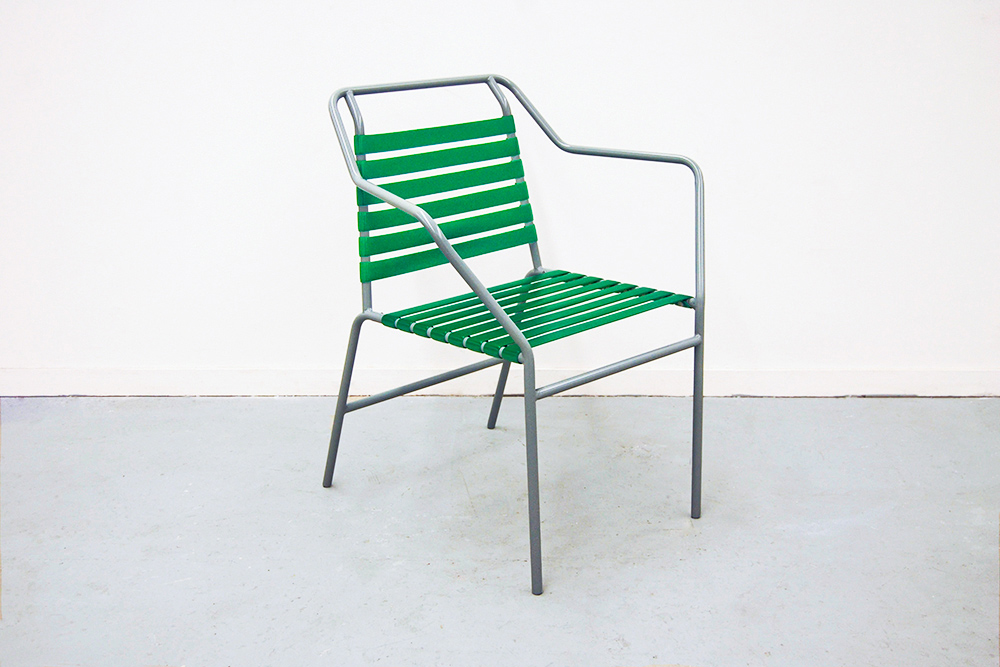
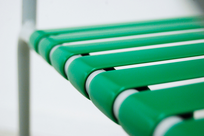
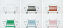
Poolside Chair
-
Development
Outdoor and indoor chair that takes inspiration from the archetypal slatted deck chair; which is then elevated by complex formal geometries, sensitivity to ergonomics, and color.
-
Materials
Steel, Vinyl
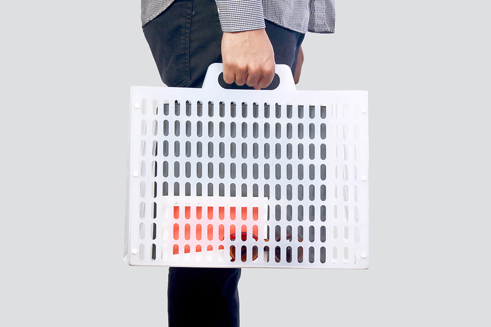
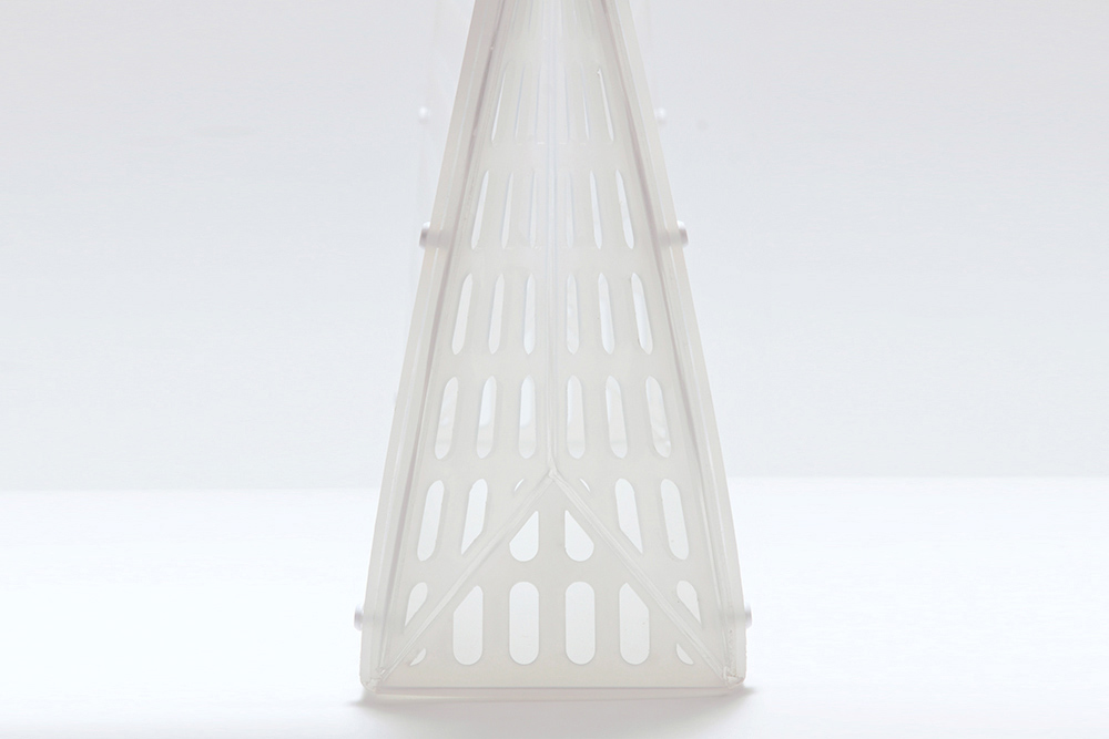
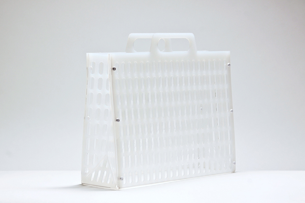
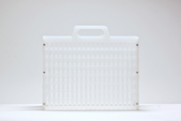
Oaxaca Case
-
Development
The briefcase is an archetype with connotations of luxury and gentrification. This polypropylene case references the material and formal language of generic shopping baskets from grocery stores, where the pattern is derived from.
The Oaxaca Case was created through two simple processes. The polypropylene sheet is laser cut, and then briefly scored by a CNC milling machine. By using living hinges it allows this two dimensional pattern to fold up and become a rigid structure. The scores on the sides allow the bag to flex open and closed. The piece quickly assembles and snaps together with polypropylene fasteners on the sides. By utilizing a sheet material, the product can be flat packed and shipped to either the retailer or the user, and easily assembled. This process results in the briefcase gaining value in both the production method and the application.
-
Materials
Polypropylene
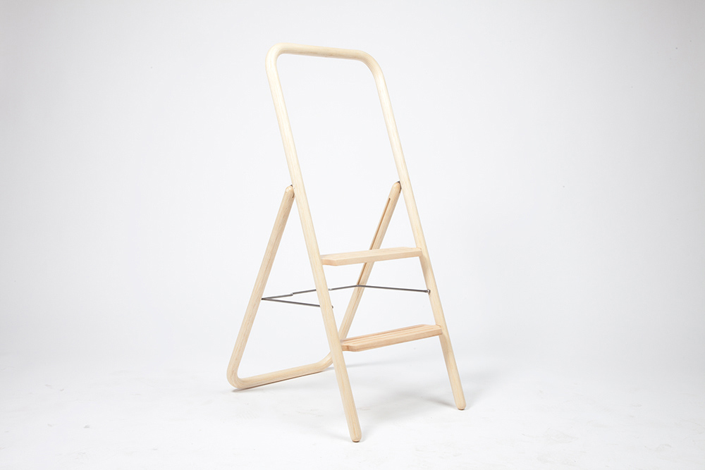
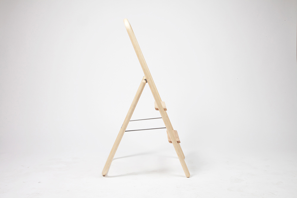
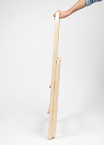
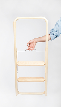
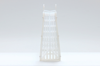
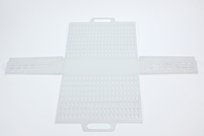
Stepladder
-
Development
A wooden stepladder. The steps are angled to be parallel with the ground when in use, curved on the sides to allow the steel mechanism to fold, and routed with grooves to provide a grip for the user. Wood is chosen for its aesthetic qualities and steel for its structural qualities. The frame consists of two bent laminated components that are produced from the same mold, for ease of manufacturing.
-
Materials
Ash Wood, Steel
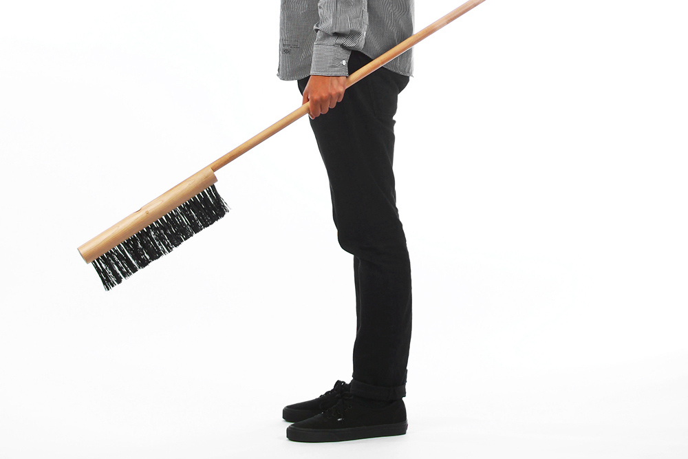
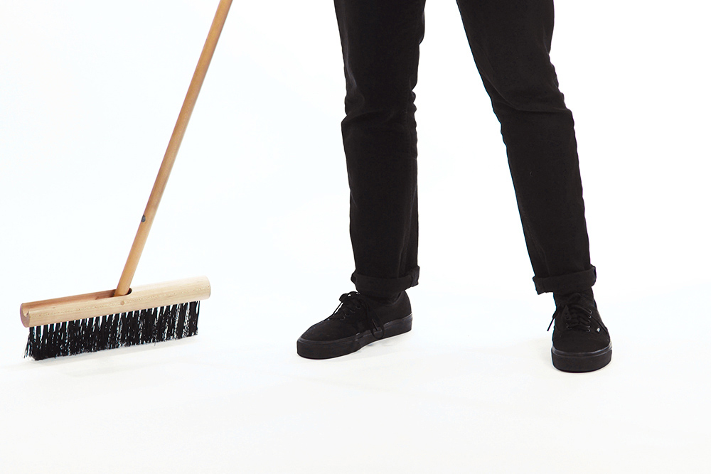
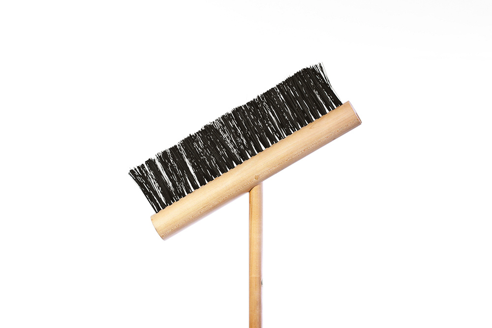
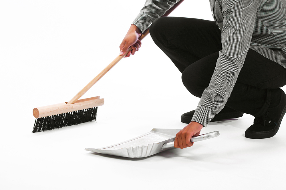
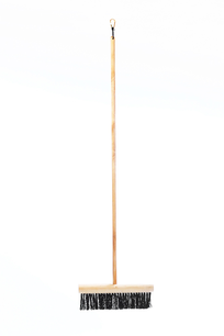
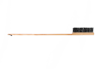
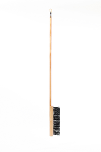
Suna Broom
-
Development
There is a connection between sweeping one's floor and raking the sand in a traditional Japanese Zen Garden. In these gardens it is not about the sand, it is about the act of raking and what one contemplates during this repetitive action. The broom works like this too; as a tool it interacts with the user on an emotional and utilitarian level.
The goal was to make a better broom, even if only by a small contribution when considering that the broom is such a highly evolved object. The focus was on the idiosyncrasies that make sweeping cumbersome and often counter-intuitive. From here we developed a broom that acts as both hand-duster and broom. The pivoting head allows it to access all corners, it stands upright on its own, and it folds and is held vertically by a magnet for easy storage; the bristles will never see damage while not in use since the broom will not be resting on them.
-
Materials
Hard Maple Wood, PVC
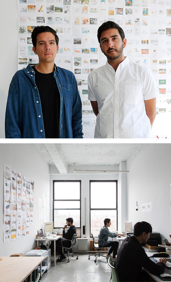
Visibility is an internationally recognized industrial design studio based in New York City. It was founded by Joseph Guerra and Sina Sohrab in 2012.
The studio focuses on the purity of an idea, as well as its material and formal actualities. The constant ambition is to move forward while looking back, drawing on observation and innovation as instruments of development. Visibility aims to distill ideas to what they want to be, retaining what appeals to our human sensibilities.
We work with a diversity of clients in a variety of fields, including furniture, lighting, electronics, appliance, and tableware design. In addition to this, we have also started to take on spatial projects, including exhibitions and store environments. Above all, we align ourselves with companies that share our interest in good, enduring design.
Inquiries and information: [email protected]
Internships: [email protected]
Clients
Newsletter
If you are interested in receiving occasional updates from us, please subscribe to our newsletter: